
SNOW JOE - ONLINE SHOPPING
E-commerce Website
Year:
2019
Role:
UI & UX
Platform:
Responsive Web across mobile and desktop
Project Overview
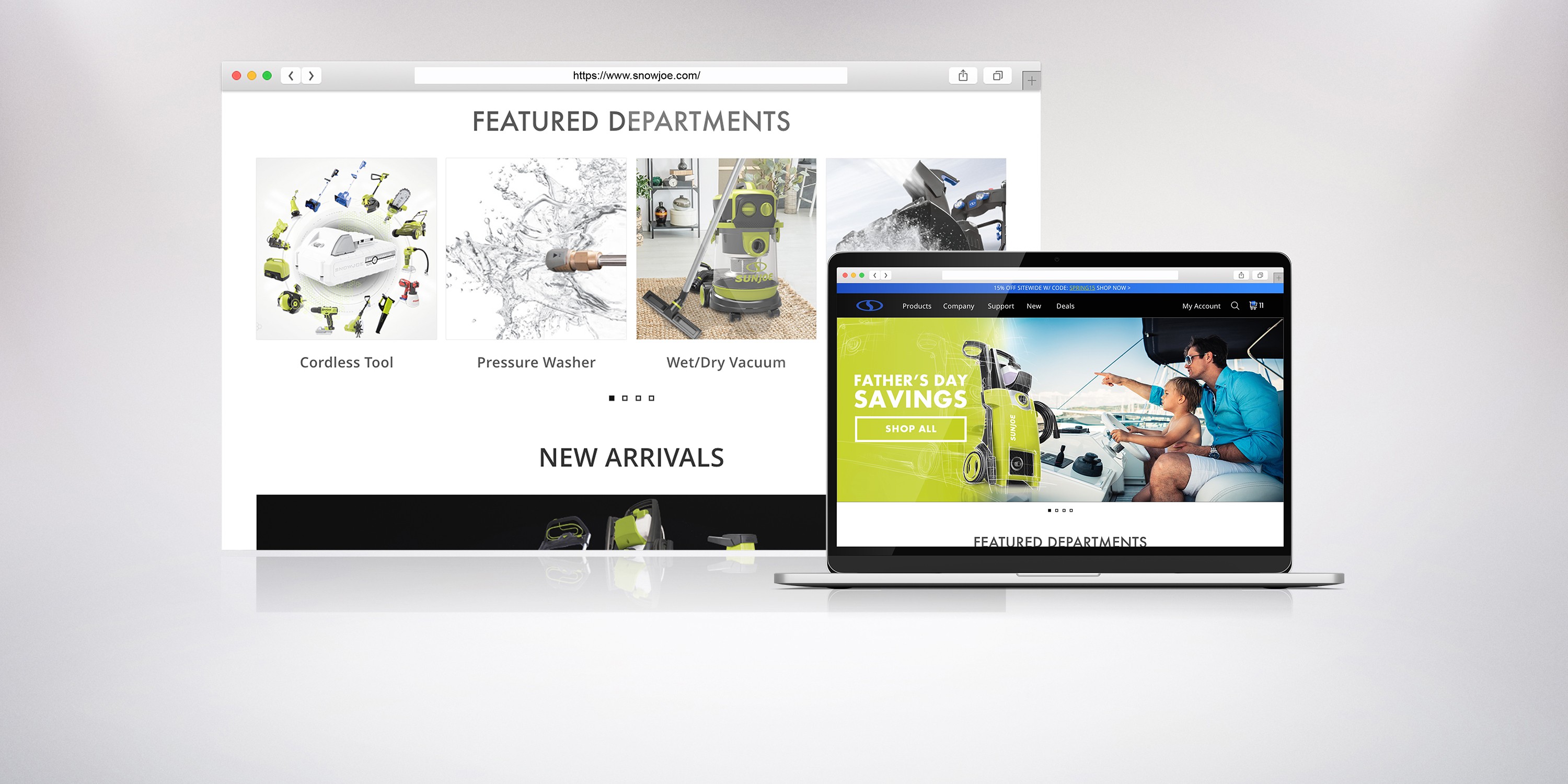
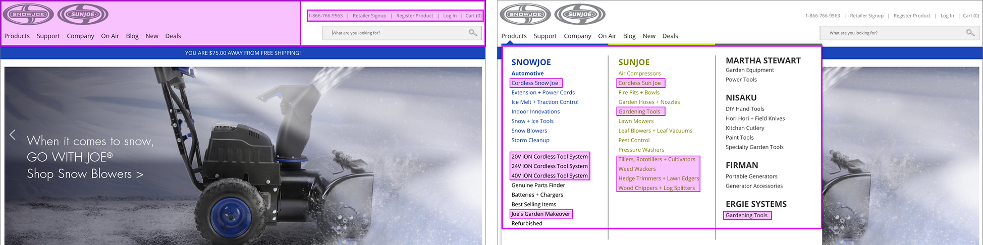
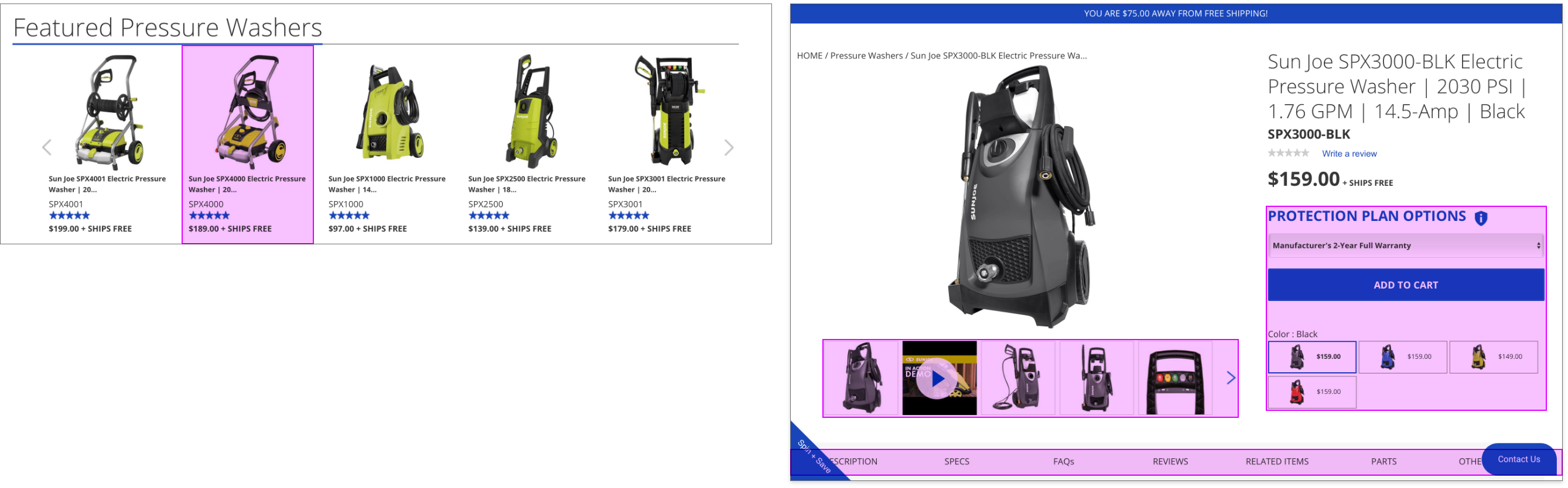
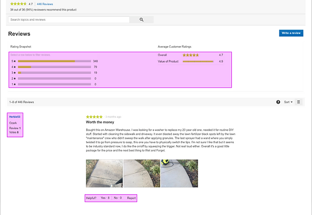
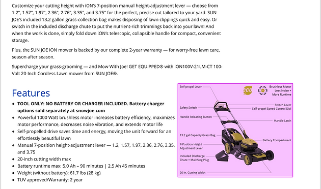
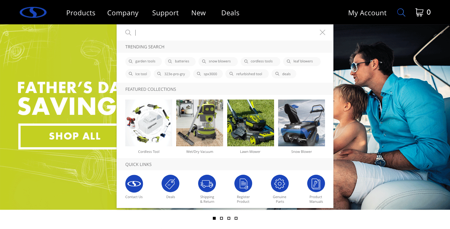
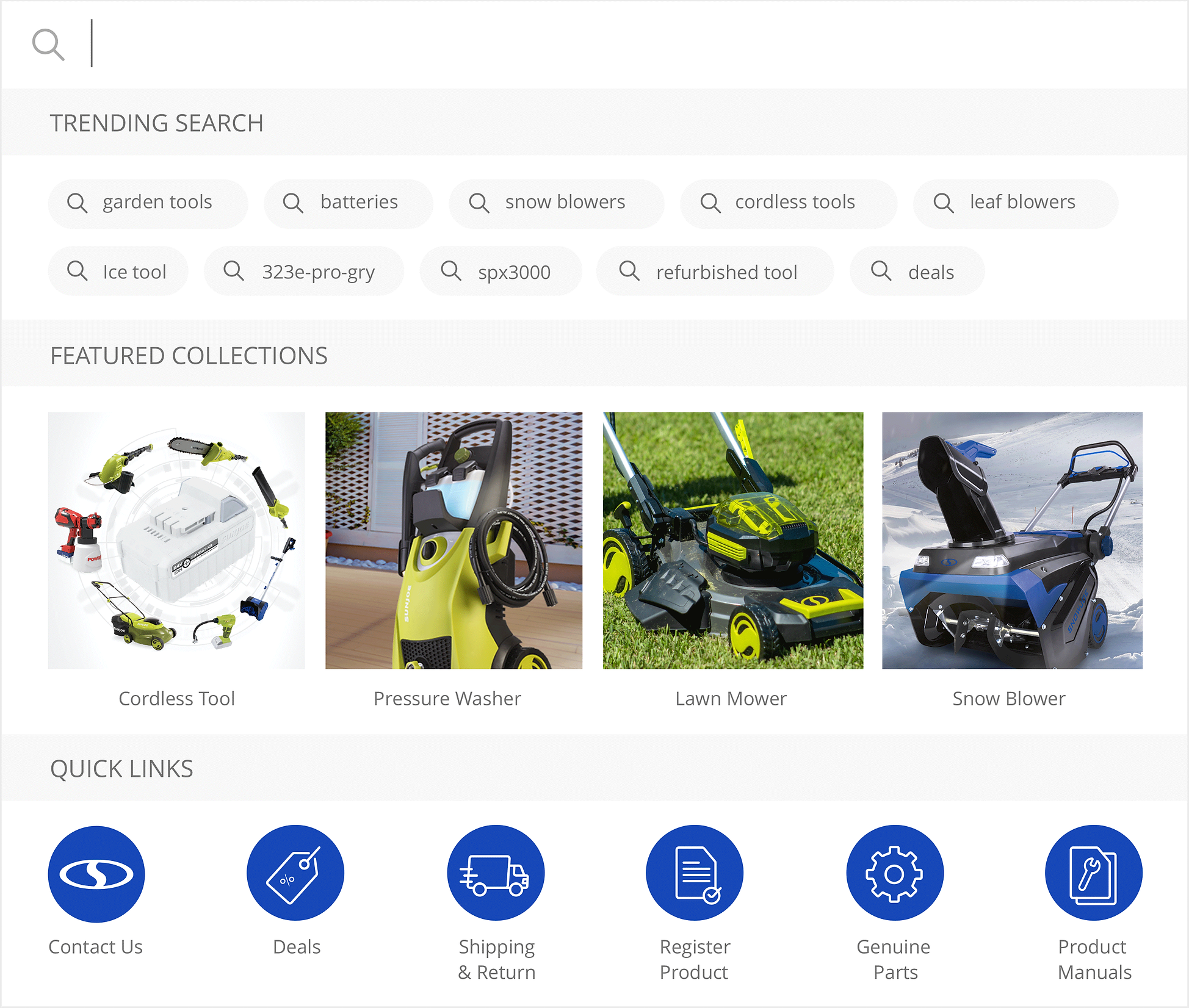
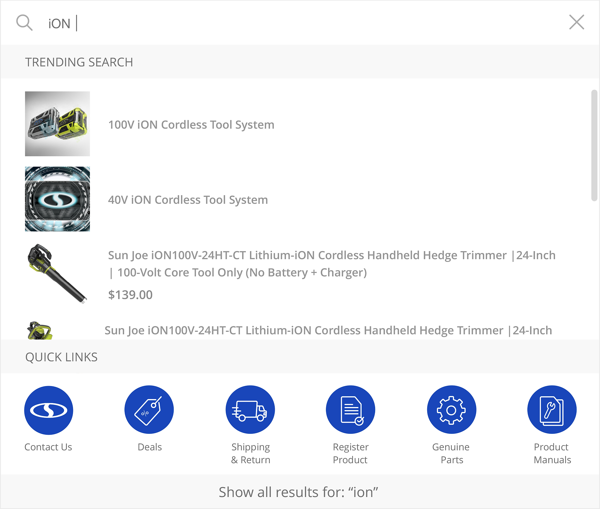
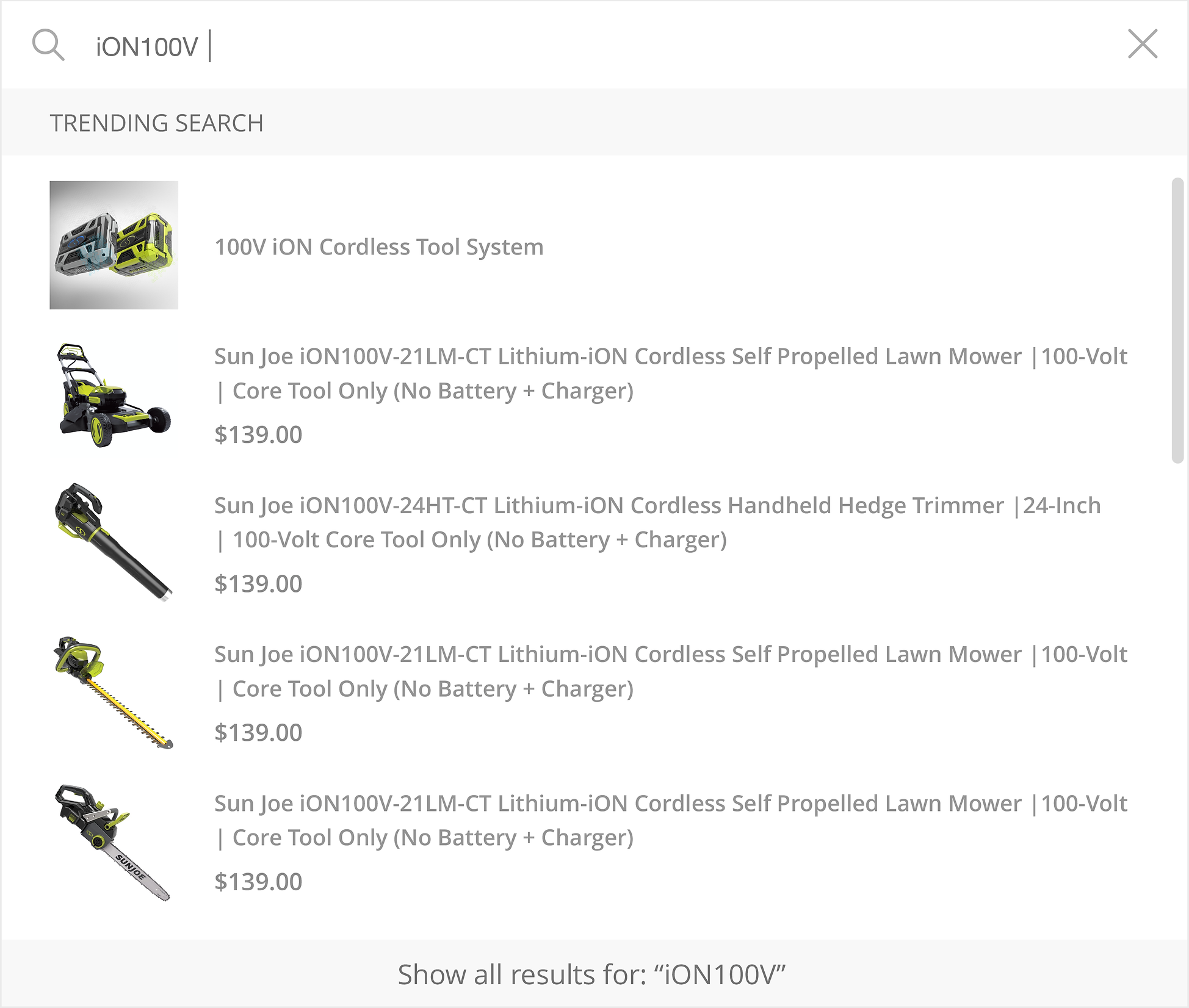
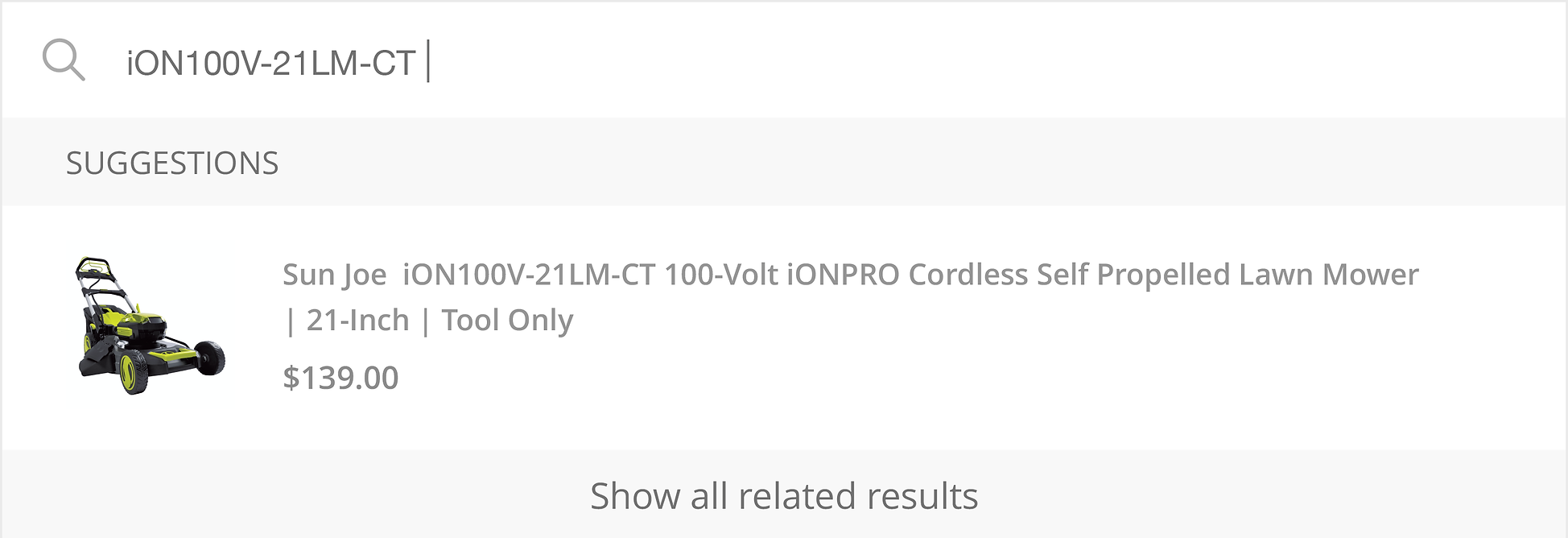
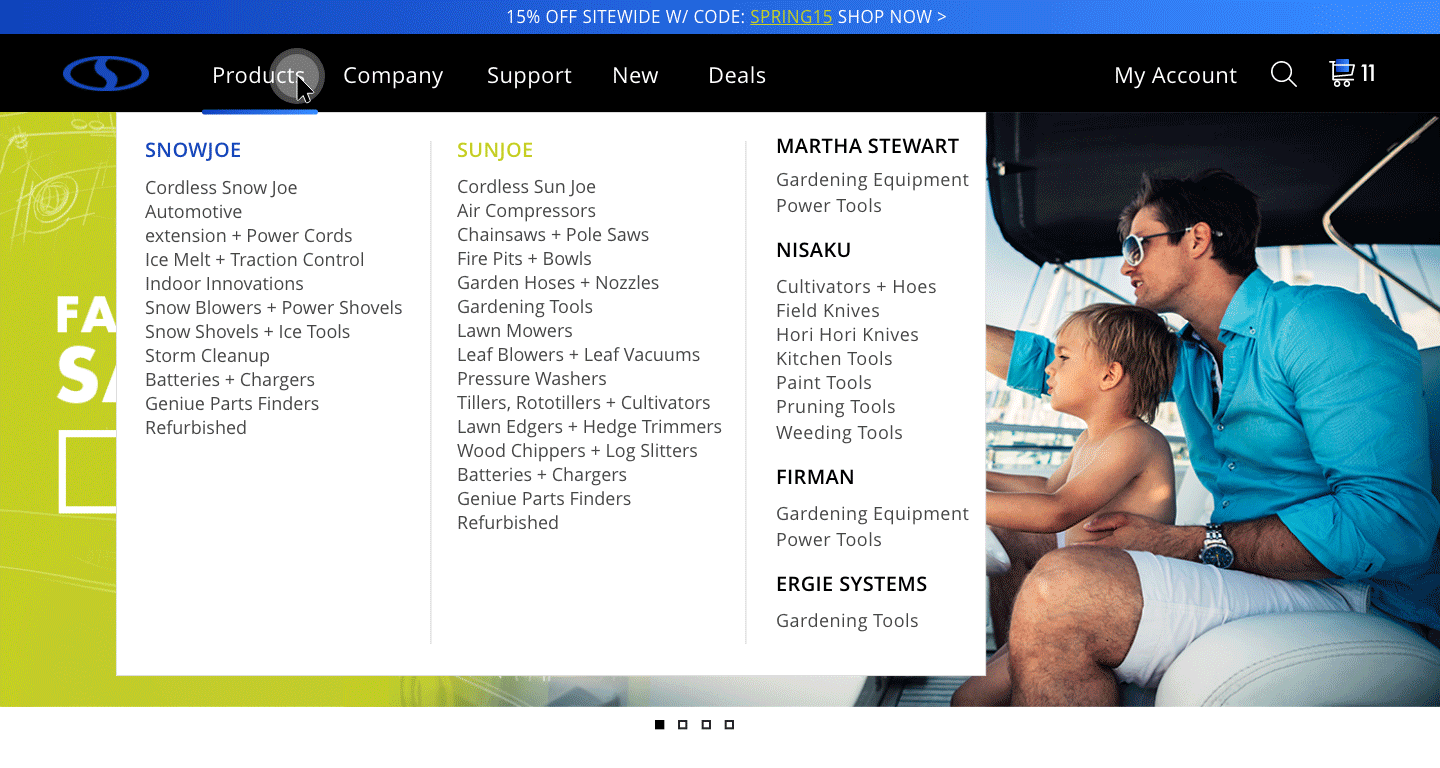
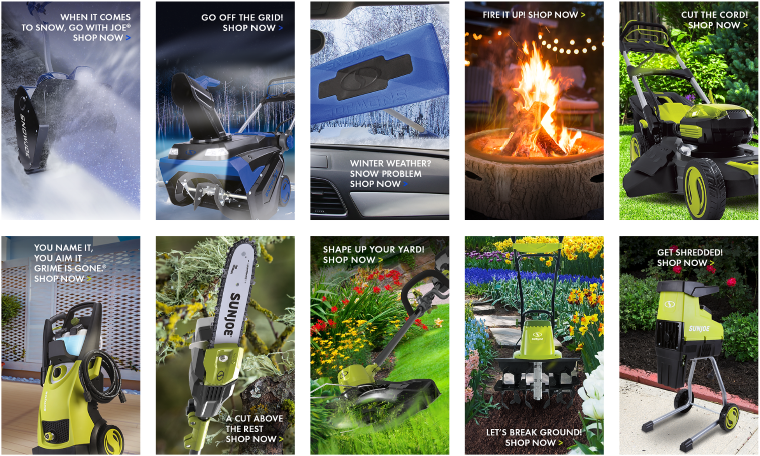
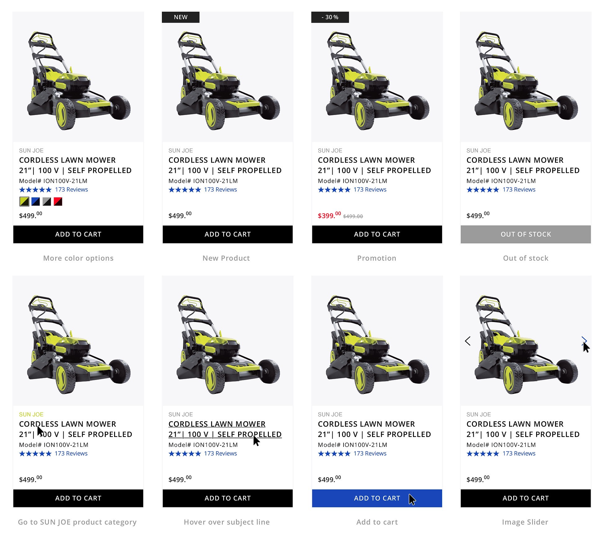
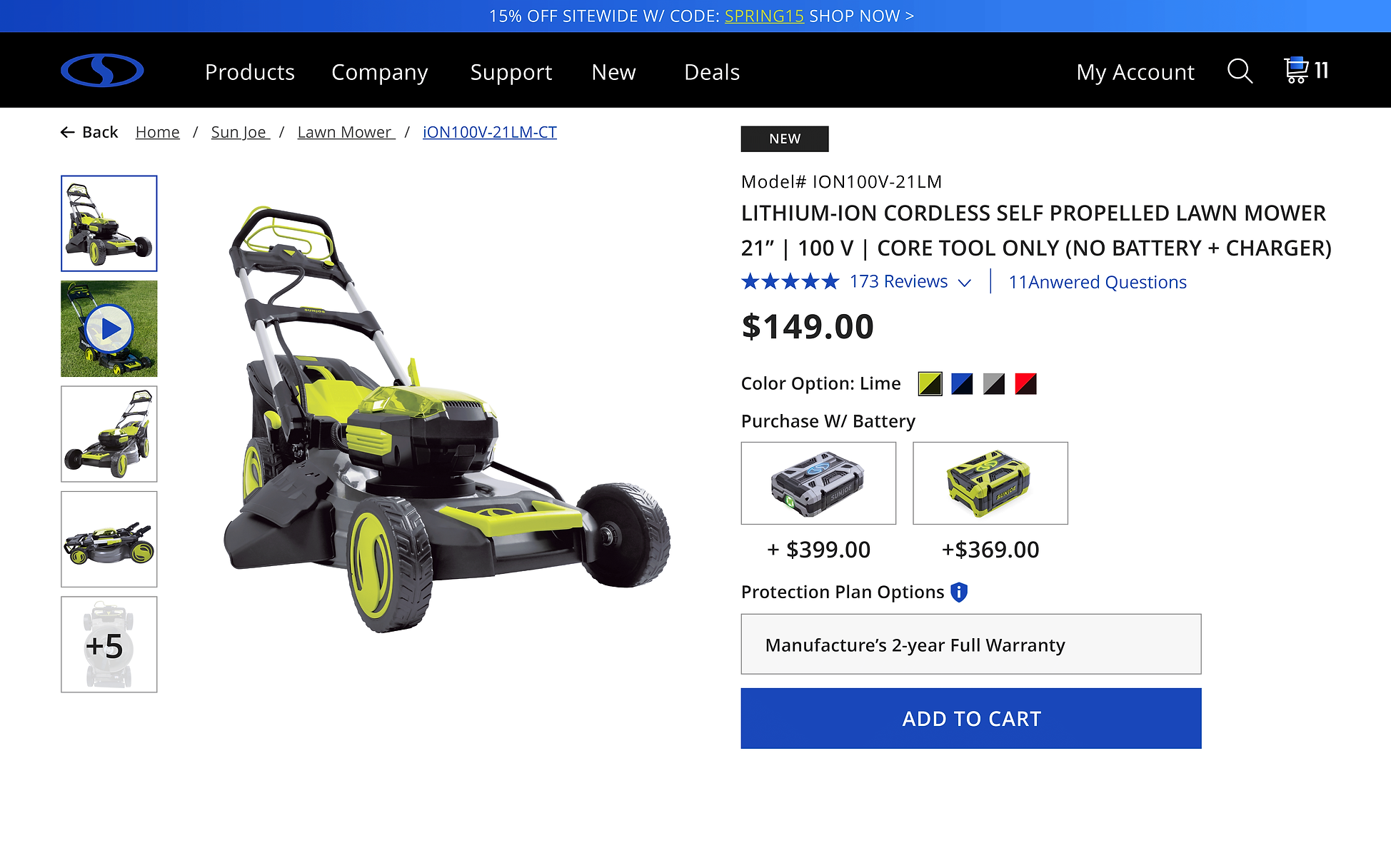
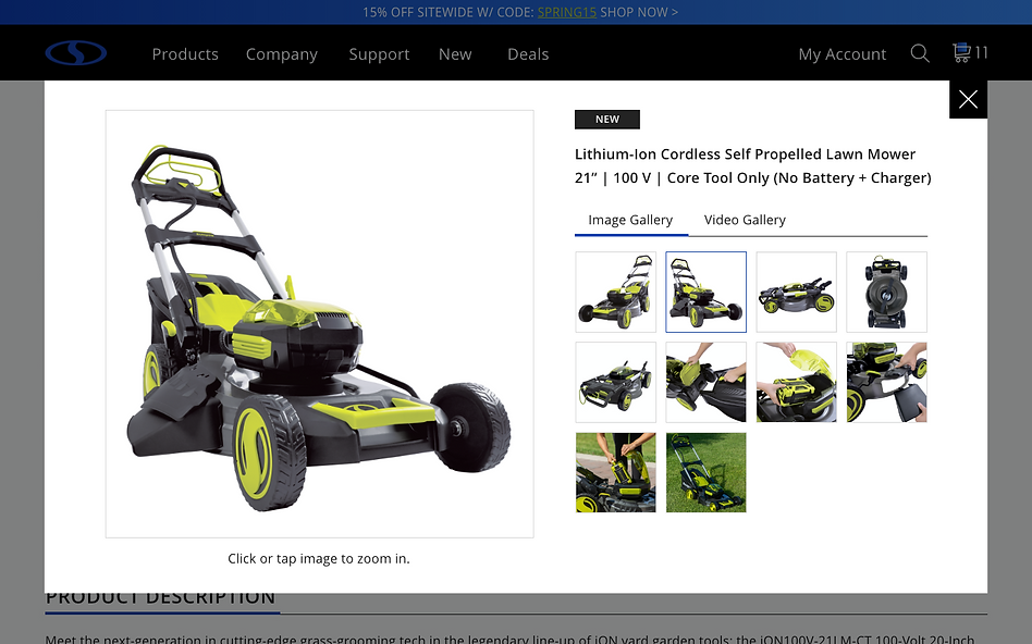
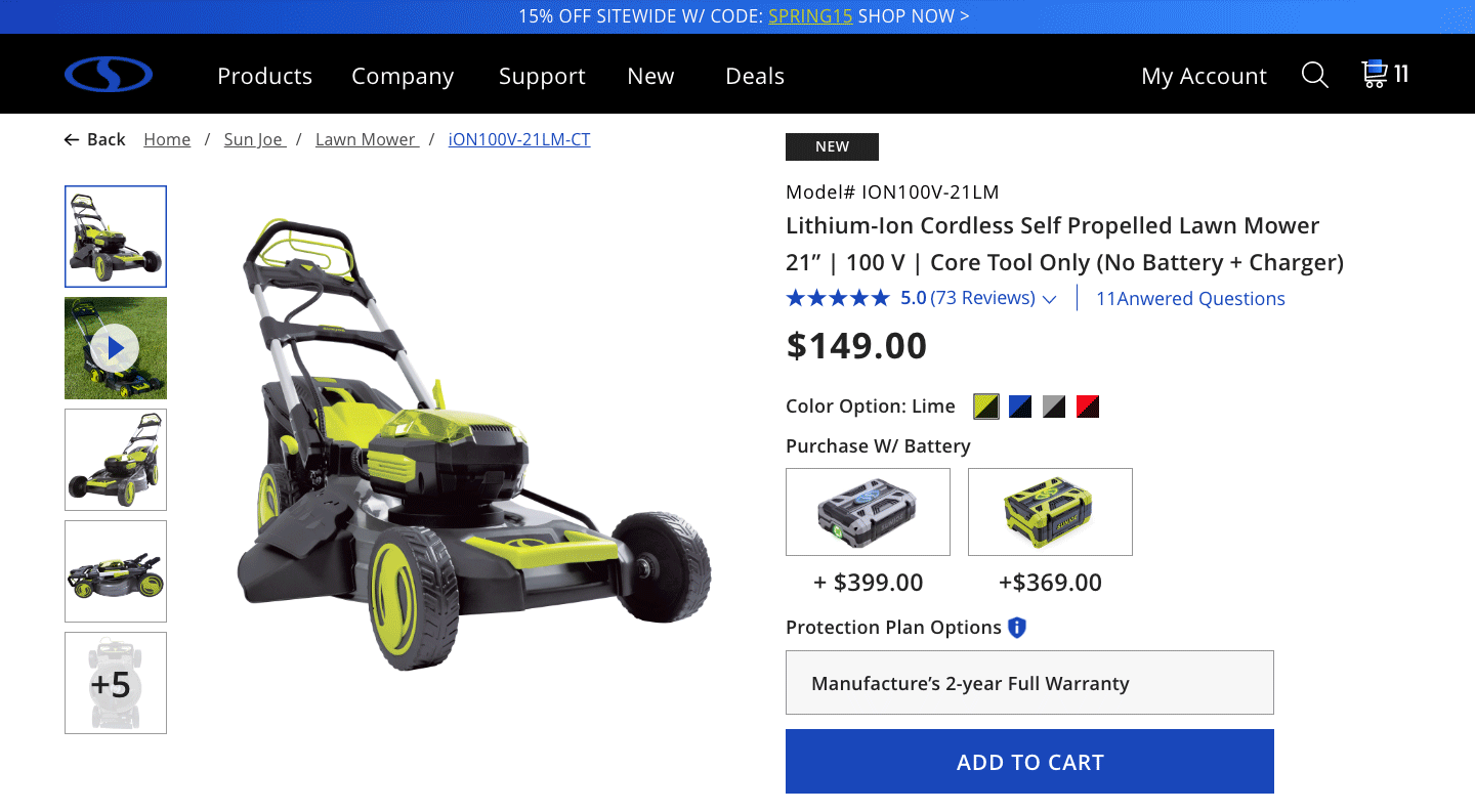
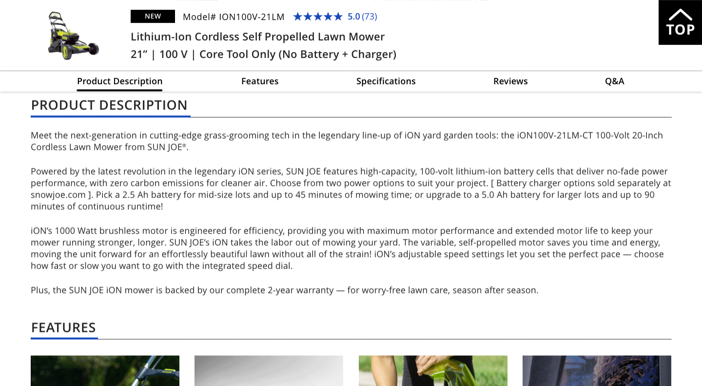
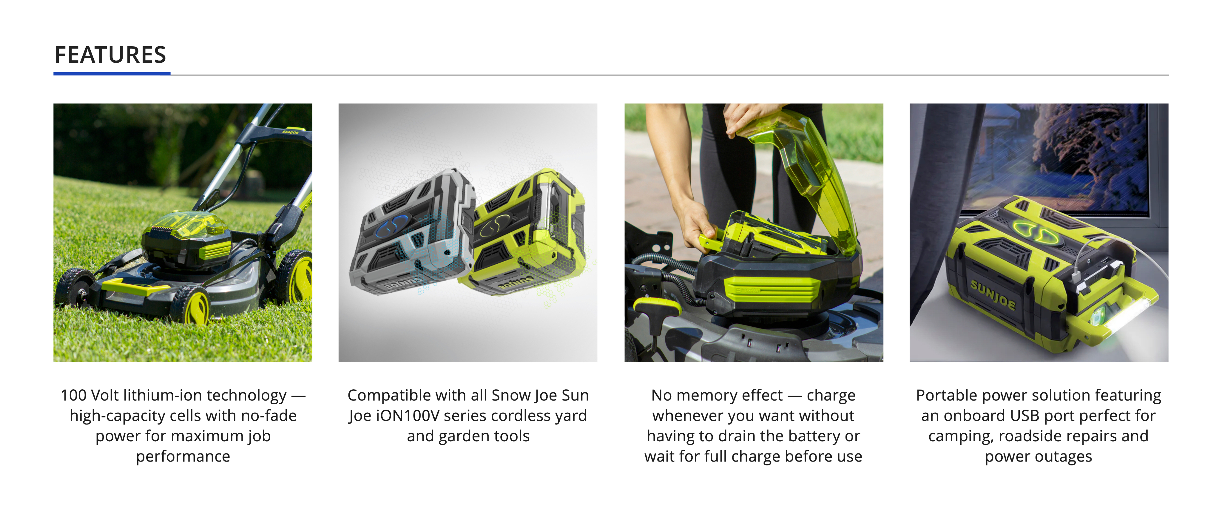
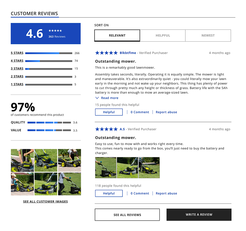
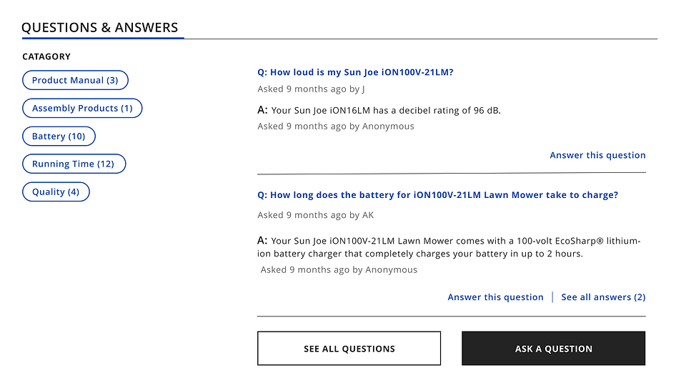
Snow Joe wants to improve its website on Navigation Bar, Sub-navigation and Product Page to make the user have a better online shopping experience and increase its website sales.
The goal is to create more long-term partnerships versus one-time experiences.
I collaborated with a UX Researcher and a Marketing Specialist to achieve this goal with the following concepts:
- Optimize the old navigation bar to help customers find the product and service quickly and precisely.
- Optimize the product card and help customers shorten their purchasing process.
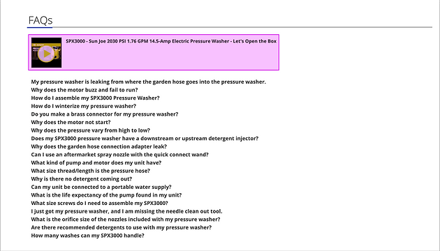
- Maximize graphic efforts for product information.
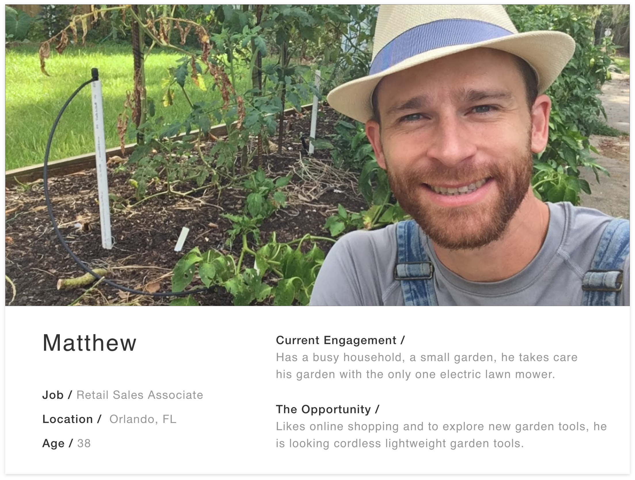
- Based on interviewing and testing our target group, try to recommend the most relevant content for the specific user.
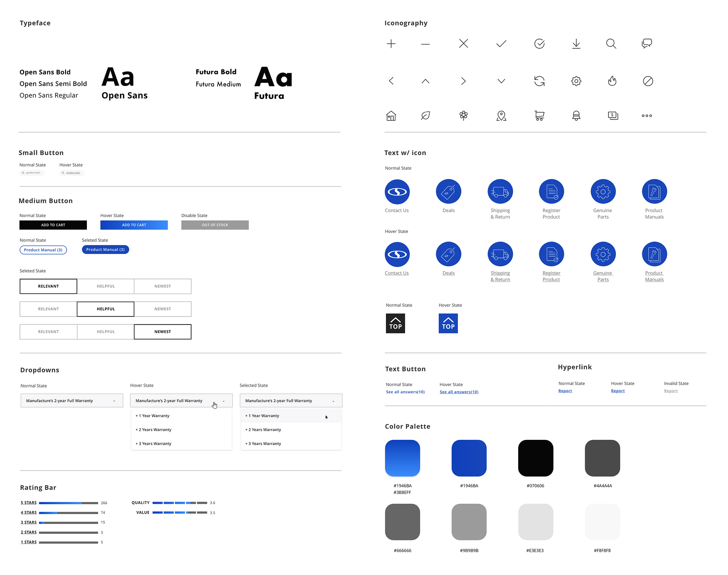
Responsibilites In this project, I worked on research, wireframe, UI design and motion prototype.


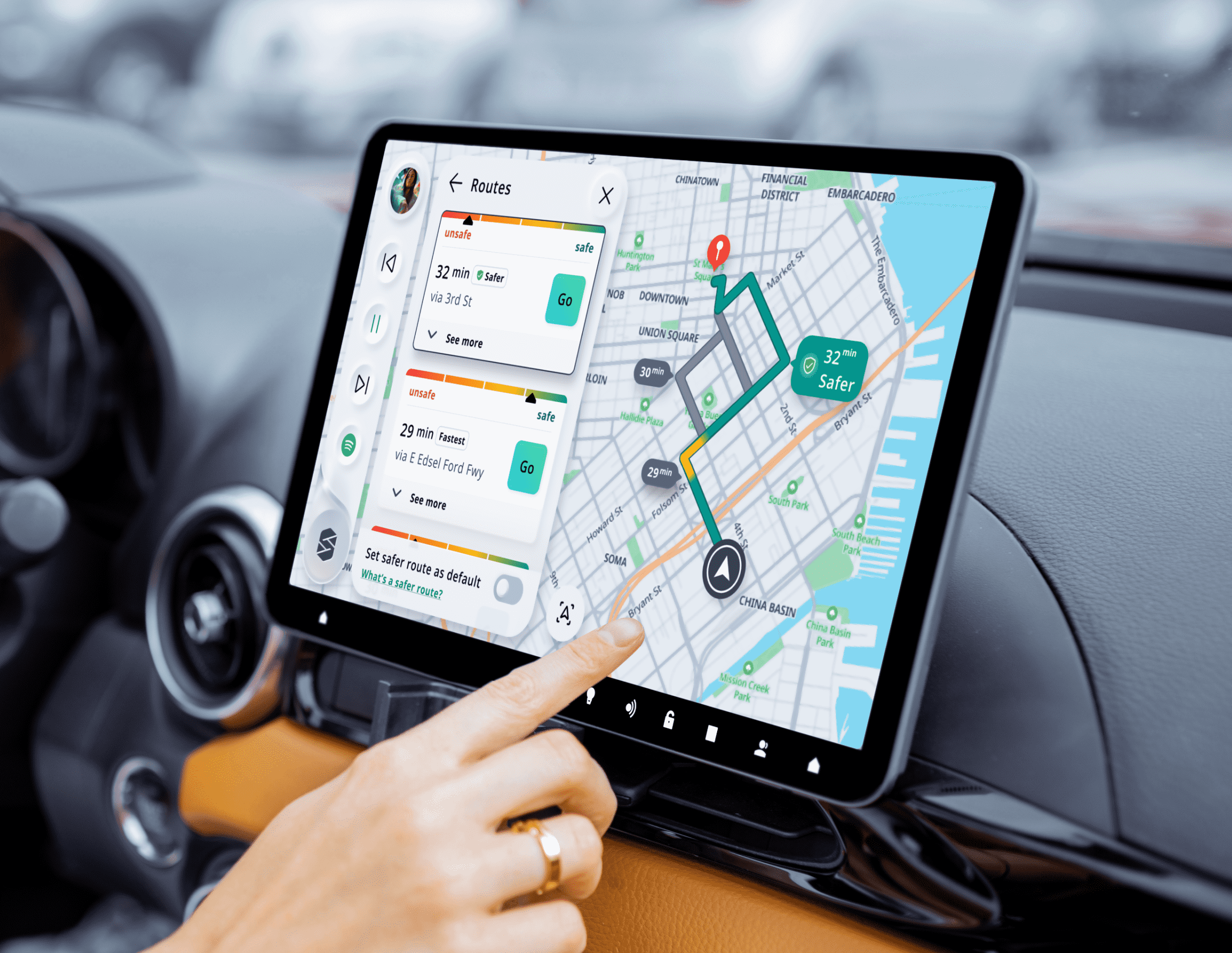
Scout Nav - Safer Route
HMI
Android Mobile
Scout Nav - Safer Route
Mobile
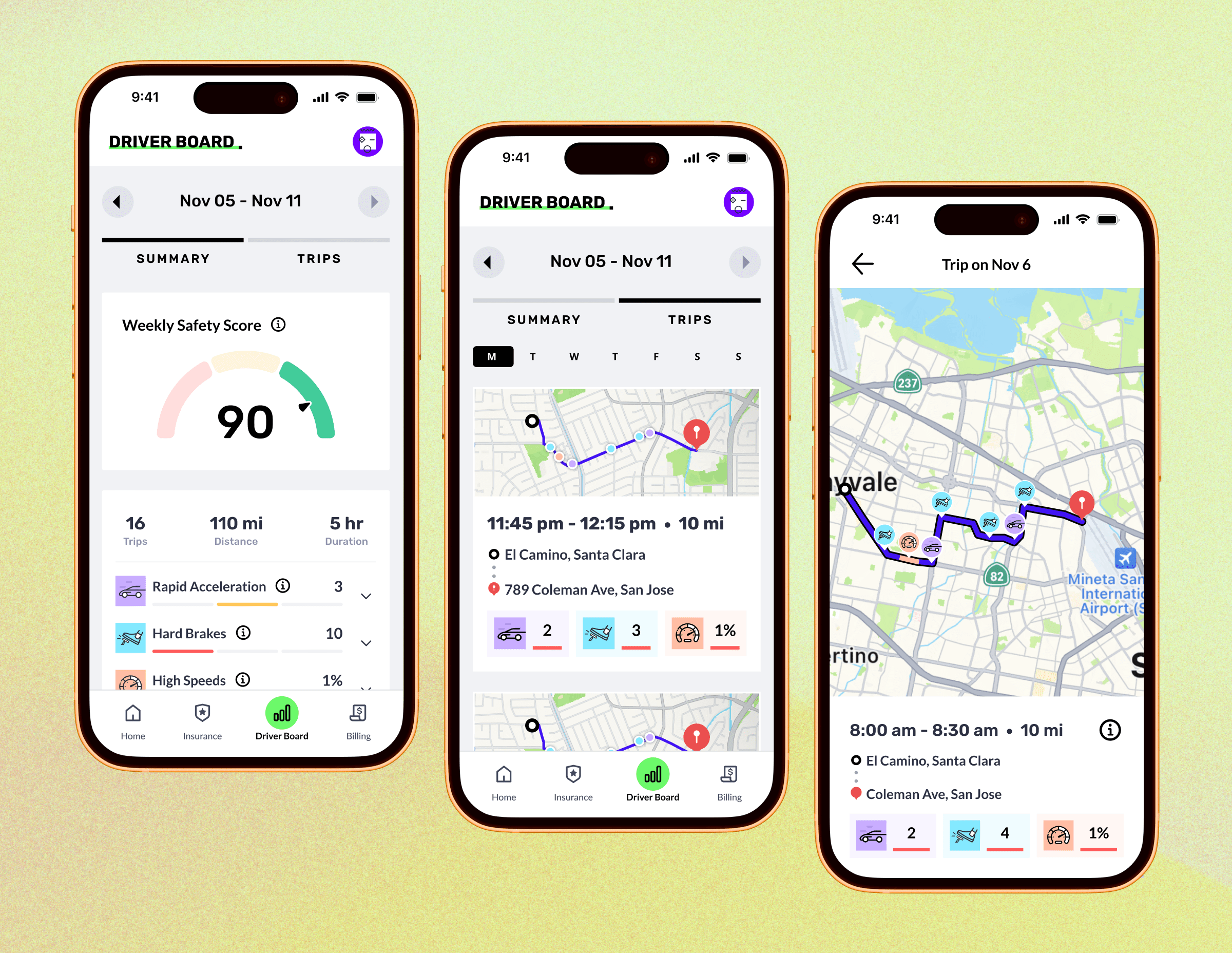
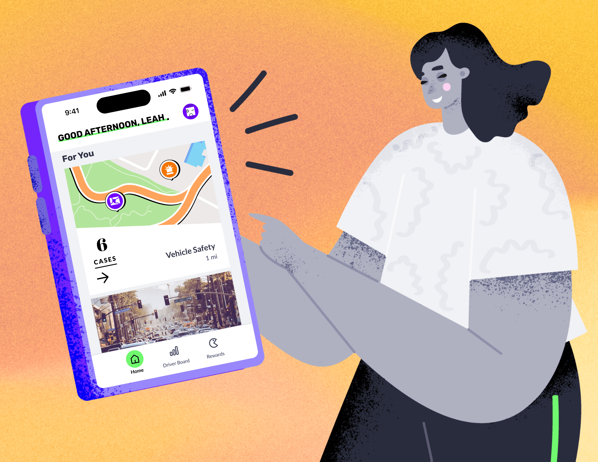
Novo - Driver Board
Mobile
Copyright @ Po Hu. All Rights Reserved
SNOW JOE - ONLINE
SHOPPING
E-commerce Website
Year:
2019
Role:
UI & UX
Product Type:
Responsive Web across mobile and desktop
Project Overview
Snow Joe wants to improve its website on Navigation Bar, Sub-navigation and Product Page to make the user have a better online shopping experience and increase its website sales.
The goal is to create more long-term partnerships versus one-time experiences.
I collaborated with a UX Researcher and a Marketing Specialist to achieve this goal with the following concepts:
- Optimize the old navigation bar to help customers find the product and service quickly and precisely.
- Optimize the product card and help customers shorten their purchasing process.
- Maximize graphic efforts for product information.
- Based on interviewing and testing our target group, try to recommend the most relevant content for the specific user.
In this project, I worked on research, wireframe, UI design and motion prototype.

Scout Nav - Safer Route
HMI
Android Mobile
Scout Nav - Safer Route
Mobile
Novo - Driver Board
Mobile
Copyright @ Po Hu. All Rights Reserved
SNOW JOE - ONLINE SHOPPING
E-commerce Website
Year:
2019
Role:
UI & UX
Platform:
Responsive Web across mobile and desktop
Project Overview
Snow Joe wants to improve its website on Navigation Bar, Sub-navigation and Product Page to make the user have a better online shopping experience and increase its website sales.
The goal is to create more long-term partnerships versus one-time experiences.
I collaborated with a UX Researcher and a Marketing Specialist to achieve this goal with the following concepts:
- Optimize the old navigation bar to help customers find the product and service quickly and precisely.
- Optimize the product card and help customers shorten their purchasing process.
- Maximize graphic efforts for product information.
- Based on interviewing and testing our target group, try to recommend the most relevant content for the specific user.
In this project, I worked on research, wireframe, UI design and motion prototype.

Scout Nav - Safer Route
HMI
Android Mobile
Scout Nav - Safer Route
Mobile
Novo - Driver Board
Mobile
Copyright @ Po Hu. All Rights Reserved