
Novo - UBI Driver Board
Mobile
Year:
2022-2023
Role:
Design Lead, UI & UX
Product Type:
Usage Based Insurance(0-1)
Project Overview
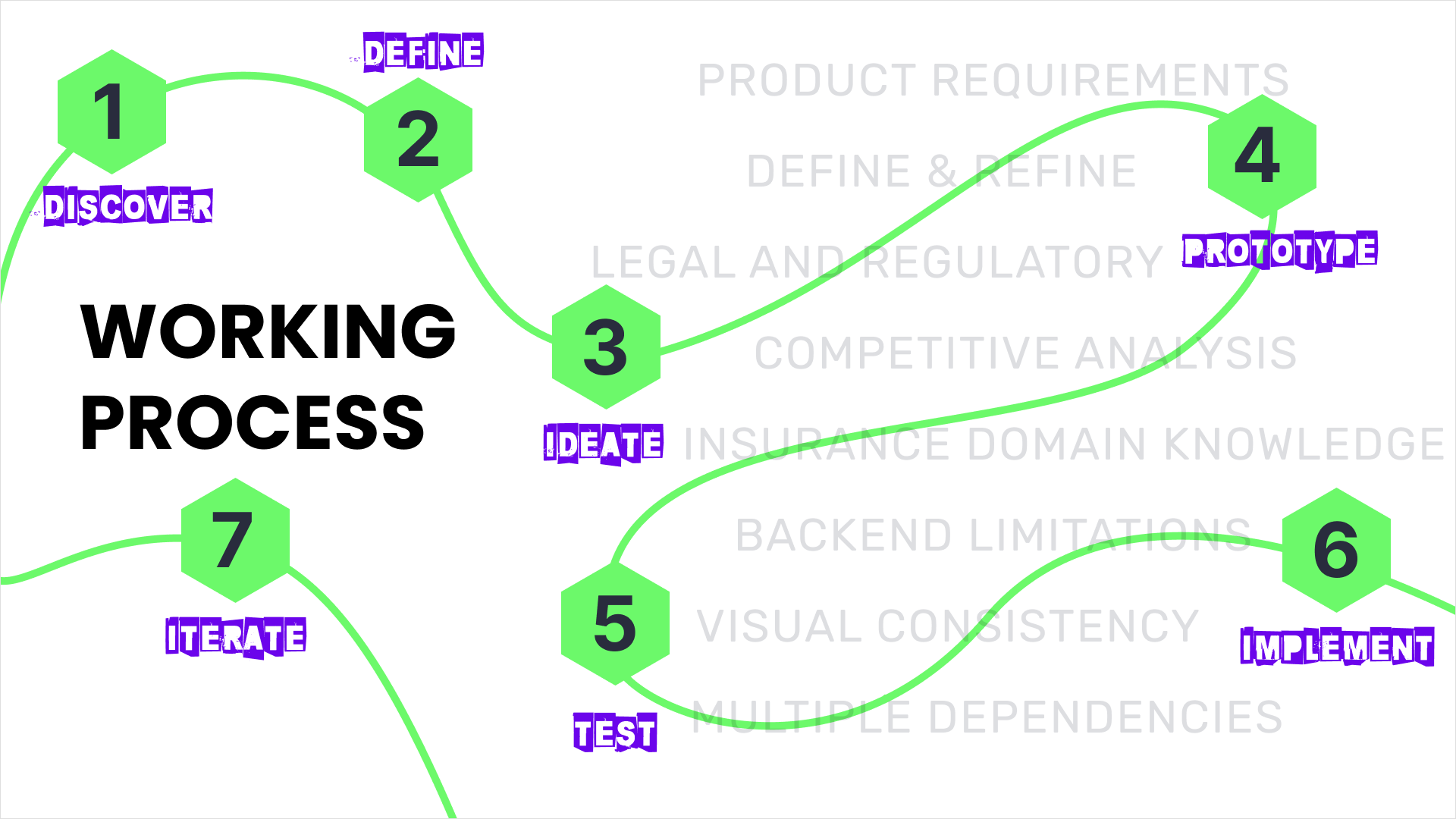
Team: Product Designer, Principal Brand Designer, Engineers, QA, Marketing/CI
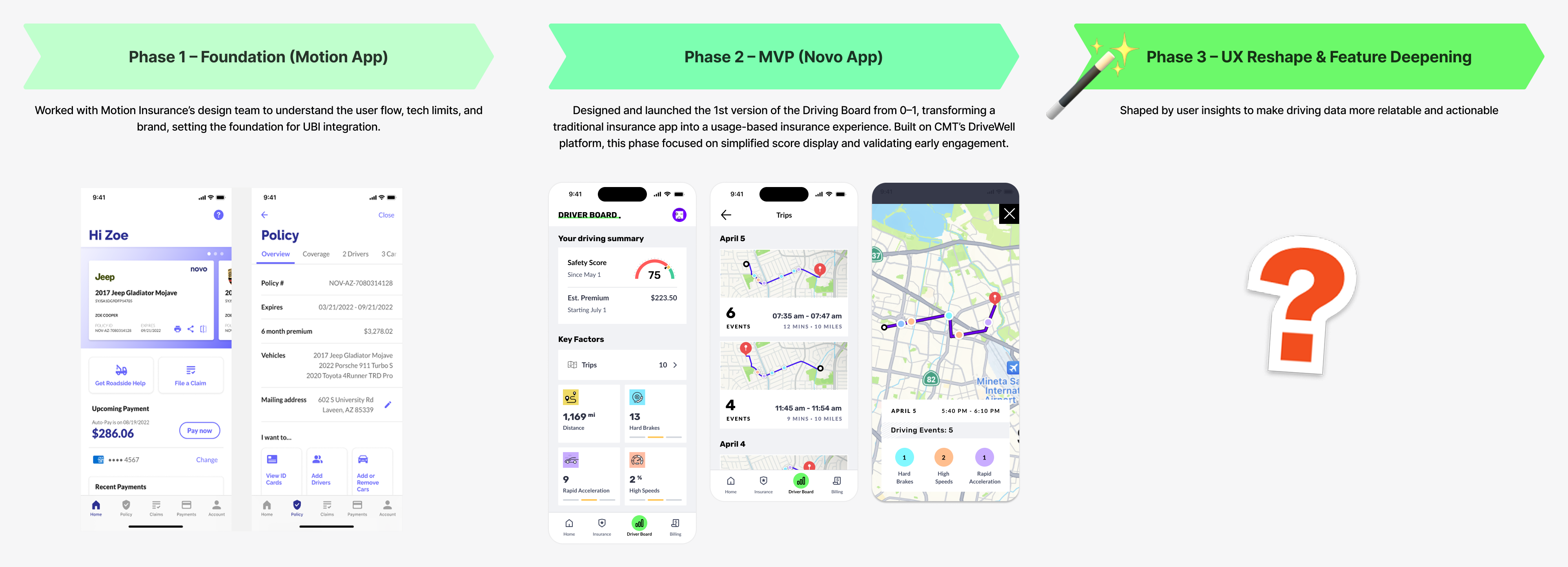
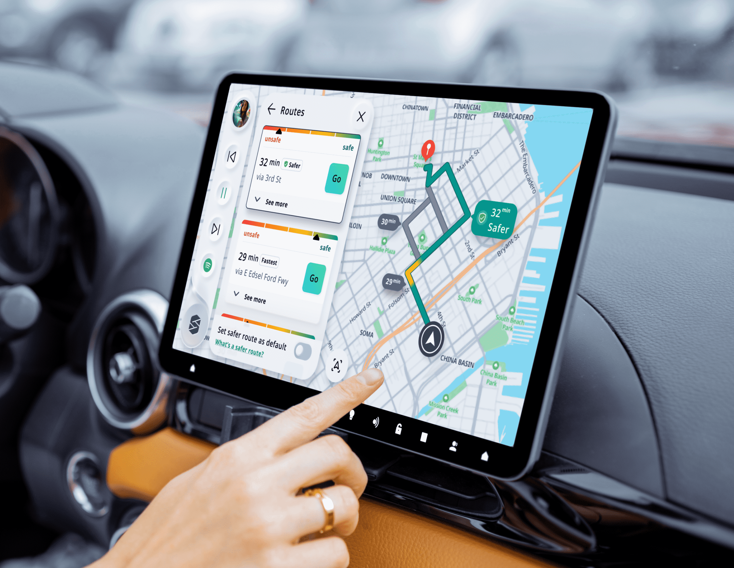
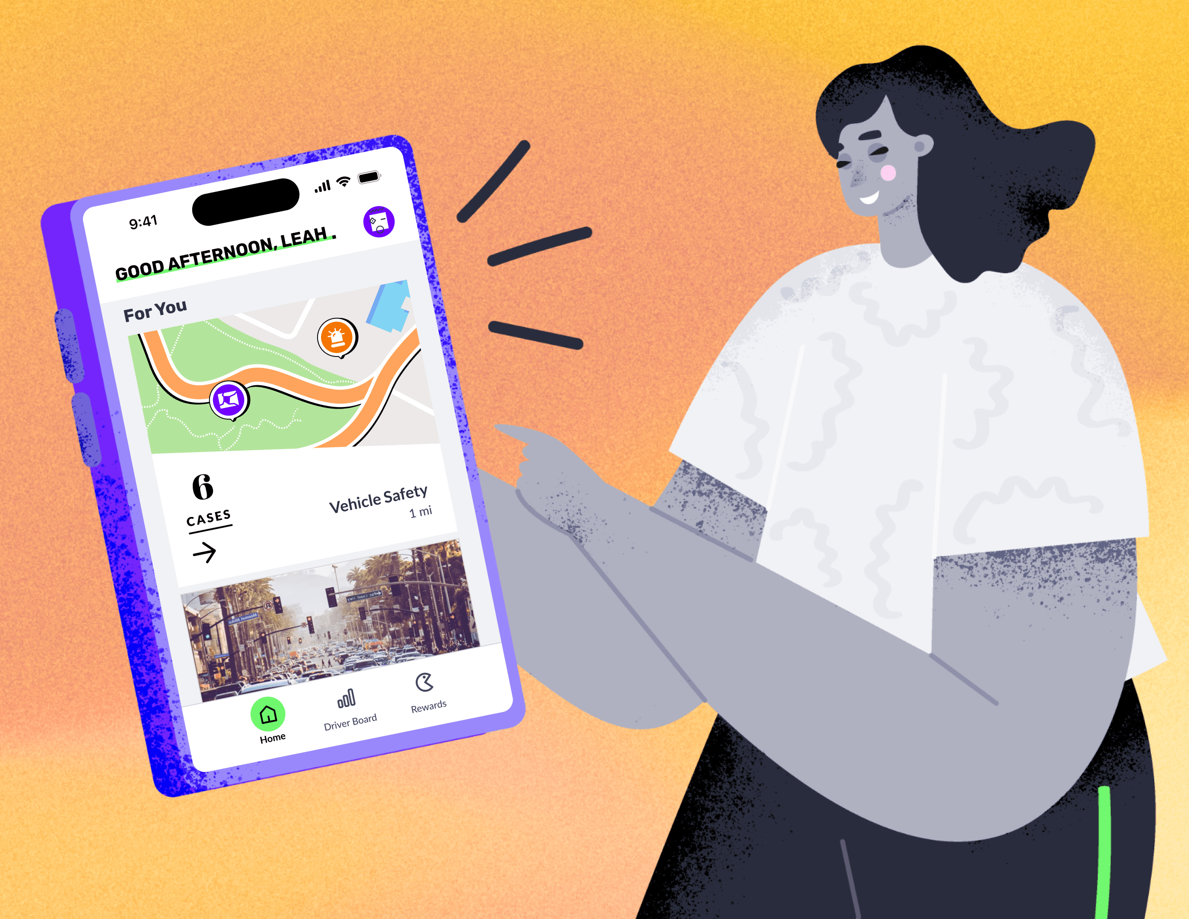
NOVO Insurance helps users understand how their driving behavior impacts their insurance costs. Over a 12-month product cycle, I led the design of the Driving Board, from defining the initial MVP to evolving it into a behavior-driven dashboard powered by Cambridge Mobile Telematics (CMT).
My role spanned all phases: from designing the 1st launchable version based on the acquired Motion Insurance app, to validating core concepts in a beta release, to reshaping the experience based on user feedback and platform constraints.
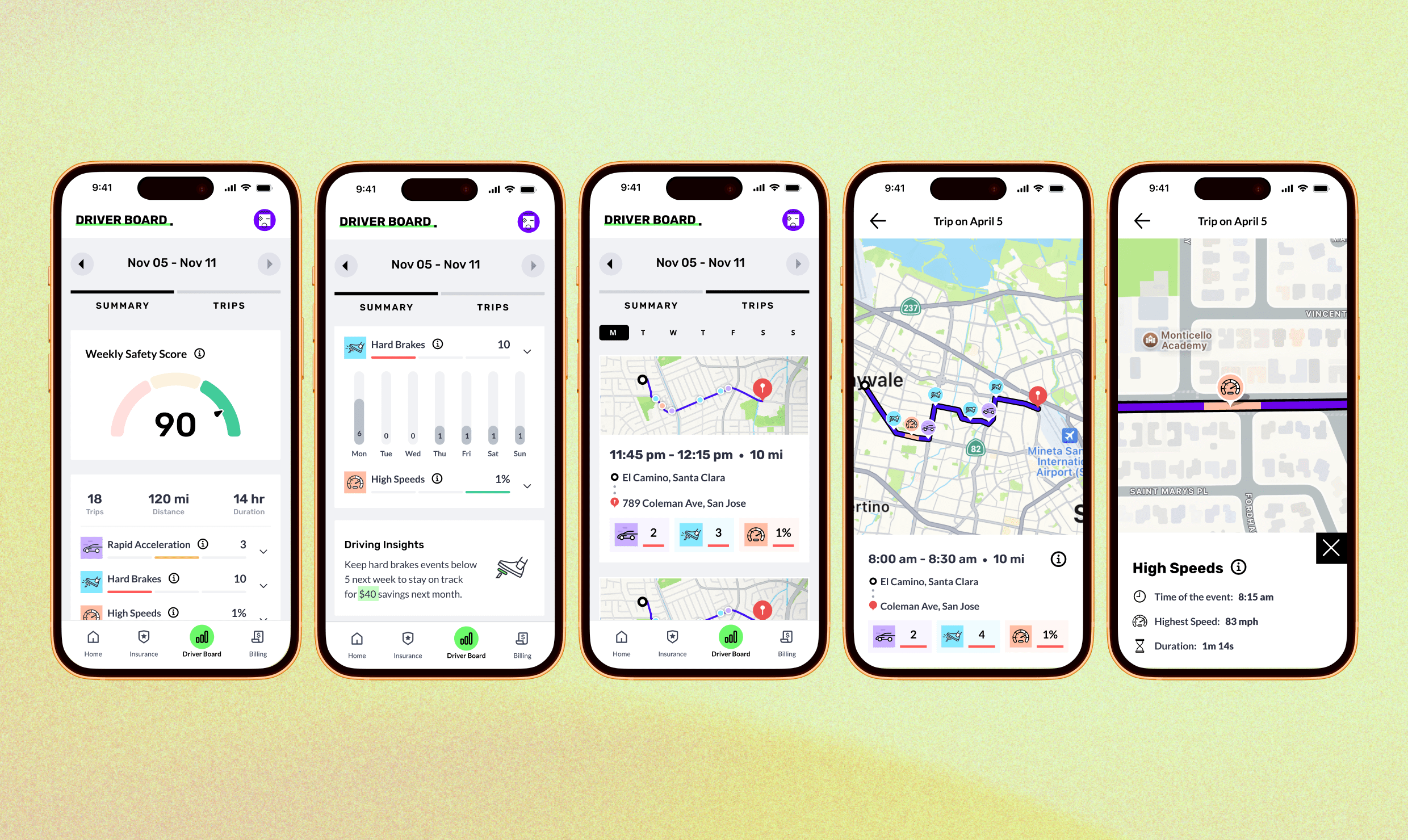
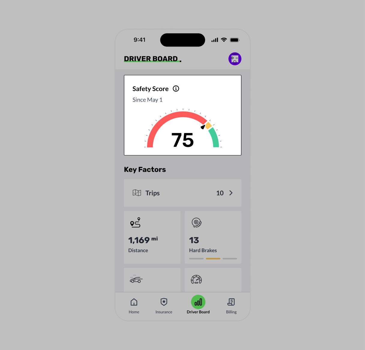
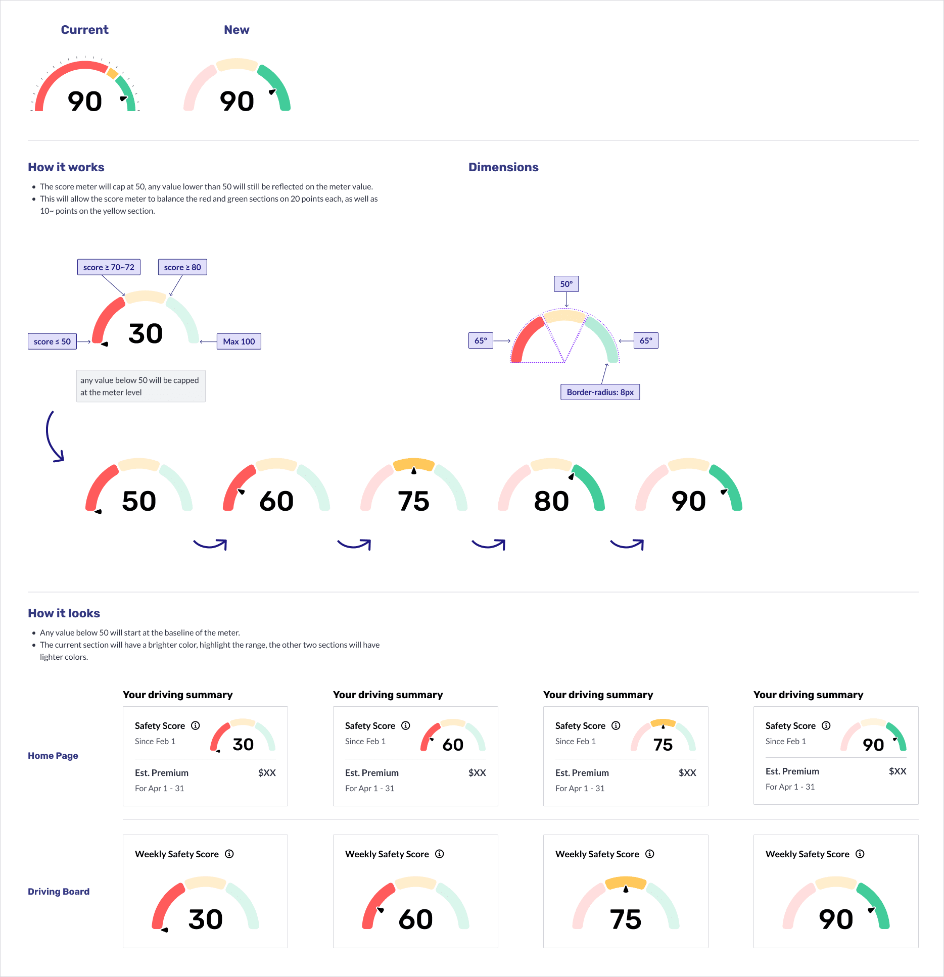
This case study focuses on Phase 3: major design evolution of the Driving Board, where I introduced weekly score breakdowns, trip-level insights, and behavior-based motivation to help users reflect and improve. Building on earlier phases, where I designed the initial launch version and validated core concepts, this iteration aimed to make driving data more actionable and personally meaningful.
Business Goal
Reduce claim/loss rates by encouraging safer driving behavior.
User Impact Goal
Help users understand their driving and improve their driving habits to potentially save money on car insurance.
How might we make driving data more specific and relatable,
so users can reflect and see its impact on insurance?
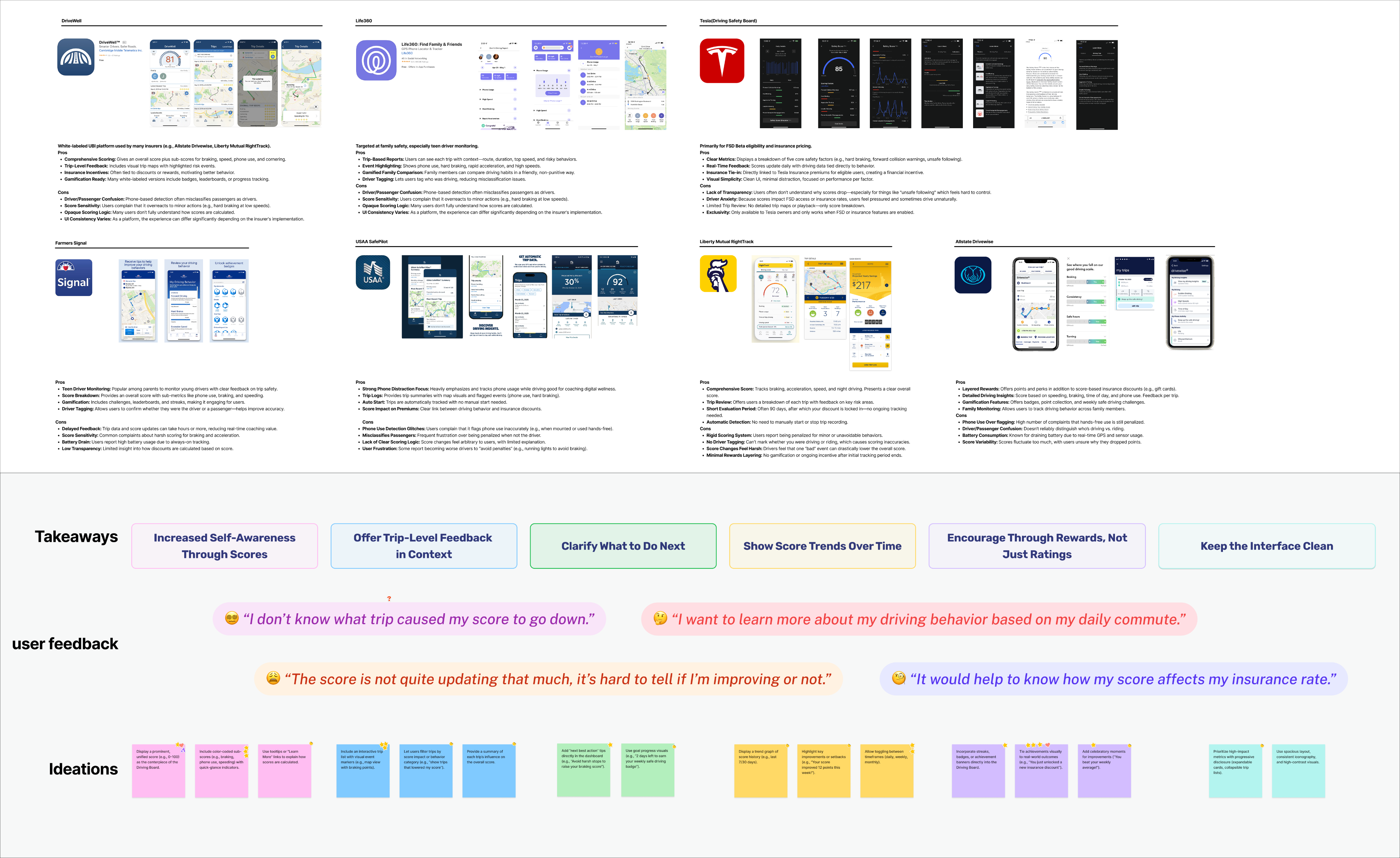
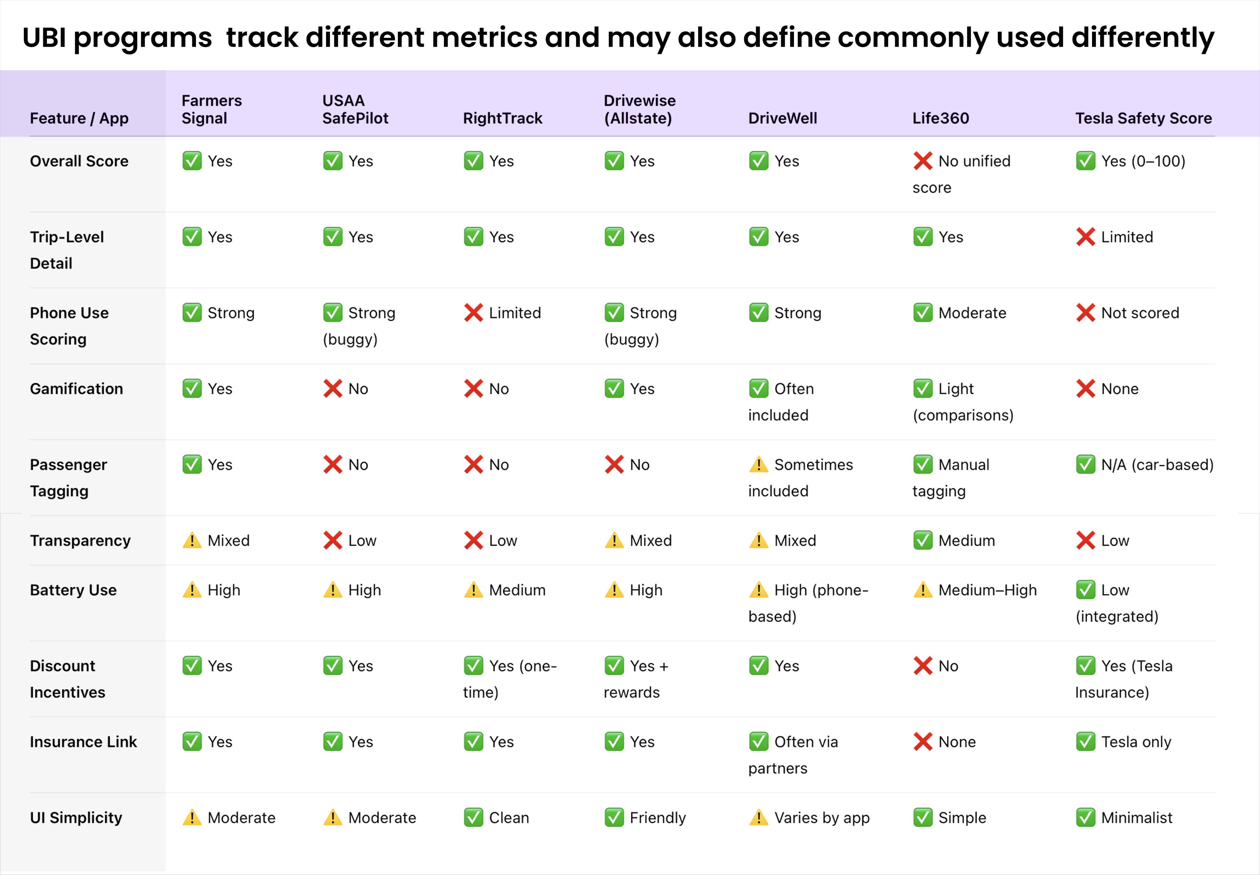
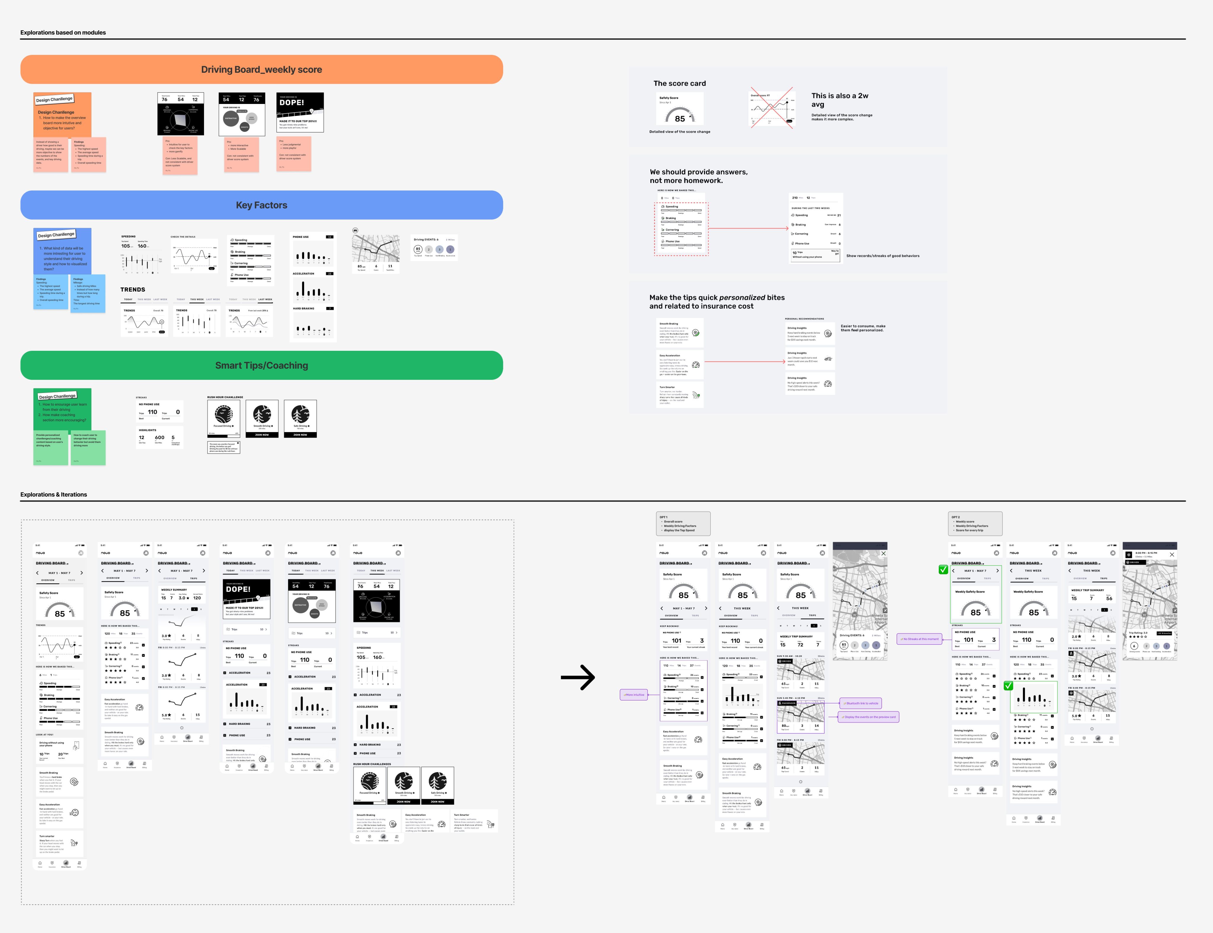
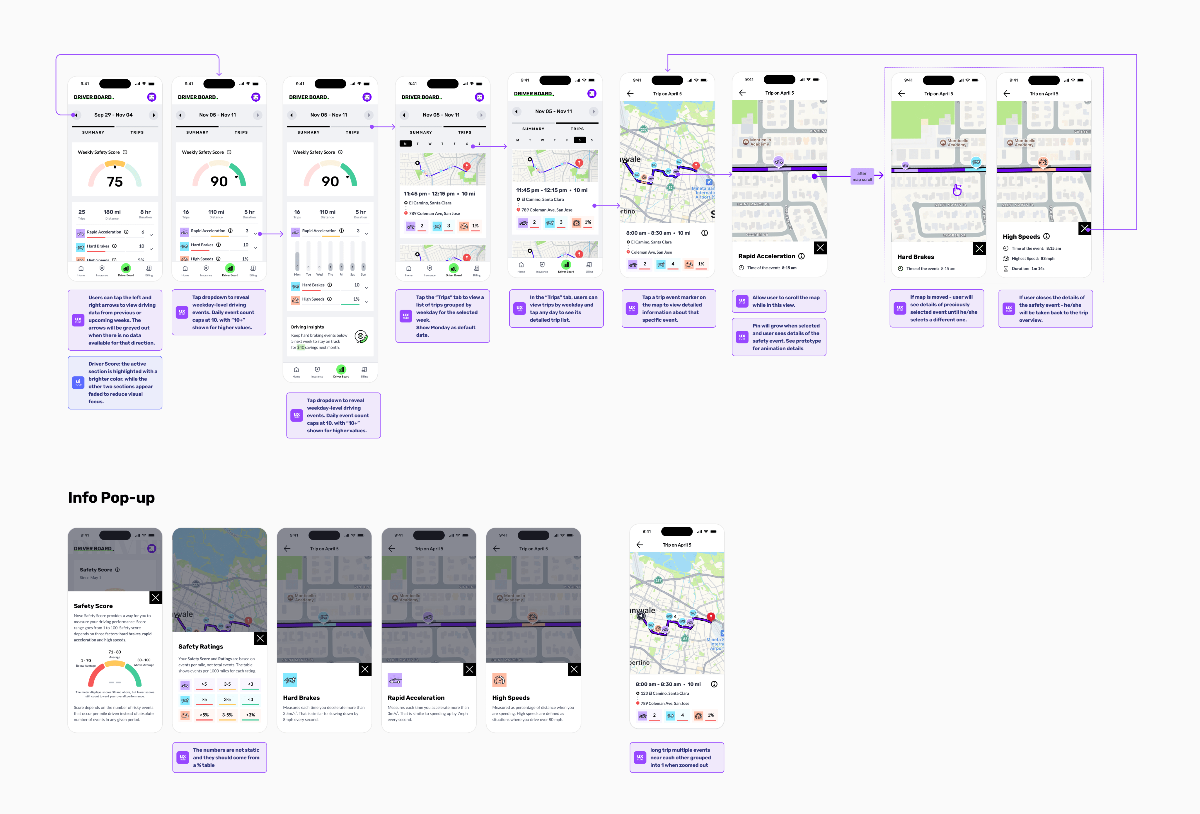
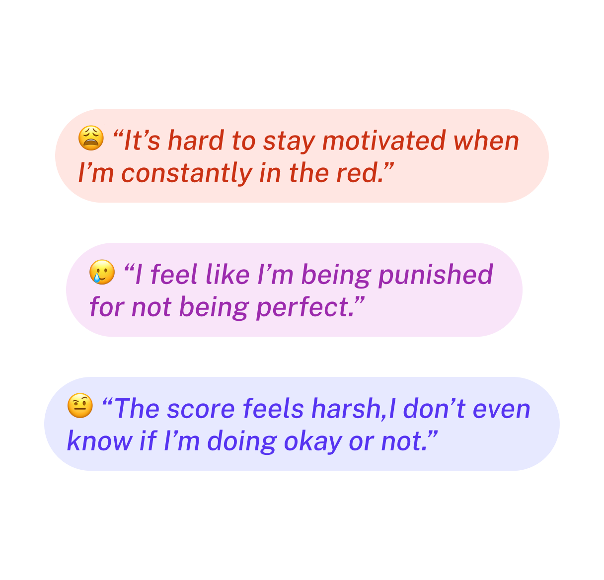
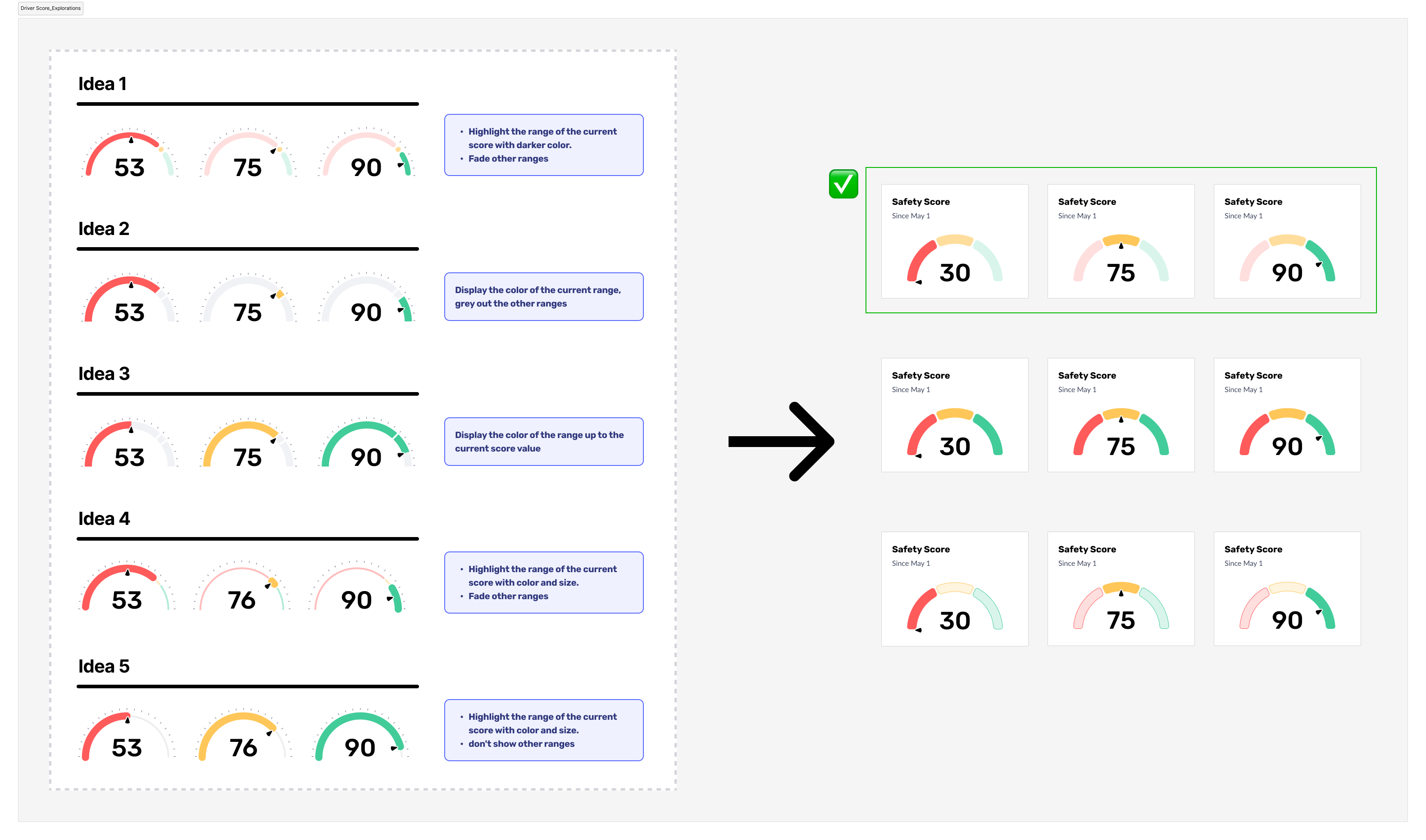
How might we present driving scores in a way that encourages reflection and improvement without overwhelming users with negative visual feedback?

Copyright @ Po Hu. All Rights Reserved
Novo - UBI Driver Board
Mobile
Year:
2022-2023
Role:
Design Lead, UI & UX
Product Type:
Usage Based Insurance(0-1)
Project Overview
Team: Product Designer, Principal Brand Designer, Engineers, QA, Marketing/CI
NOVO Insurance helps users understand how their driving behavior impacts their insurance costs. Over a 12-month product cycle, I led the design of the Driving Board, from defining the initial MVP to evolving it into a behavior-driven dashboard powered by Cambridge Mobile Telematics (CMT).
My role spanned all phases: from designing the 1st launchable version based on the acquired Motion Insurance app, to validating core concepts in a beta release, to reshaping the experience based on user feedback and platform constraints.
This case study focuses on Phase 3: major design evolution of the Driving Board, where I introduced weekly score breakdowns, trip-level insights, and behavior-based motivation to help users reflect and improve. Building on earlier phases, where I designed the initial launch version and validated core concepts, this iteration aimed to make driving data more actionable and personally meaningful.
Business Goal
Reduce claim/loss rates by encouraging safer driving behavior.
User Impact Goal
Help users understand their driving and improve their driving habits to potentially save money on car insurance.
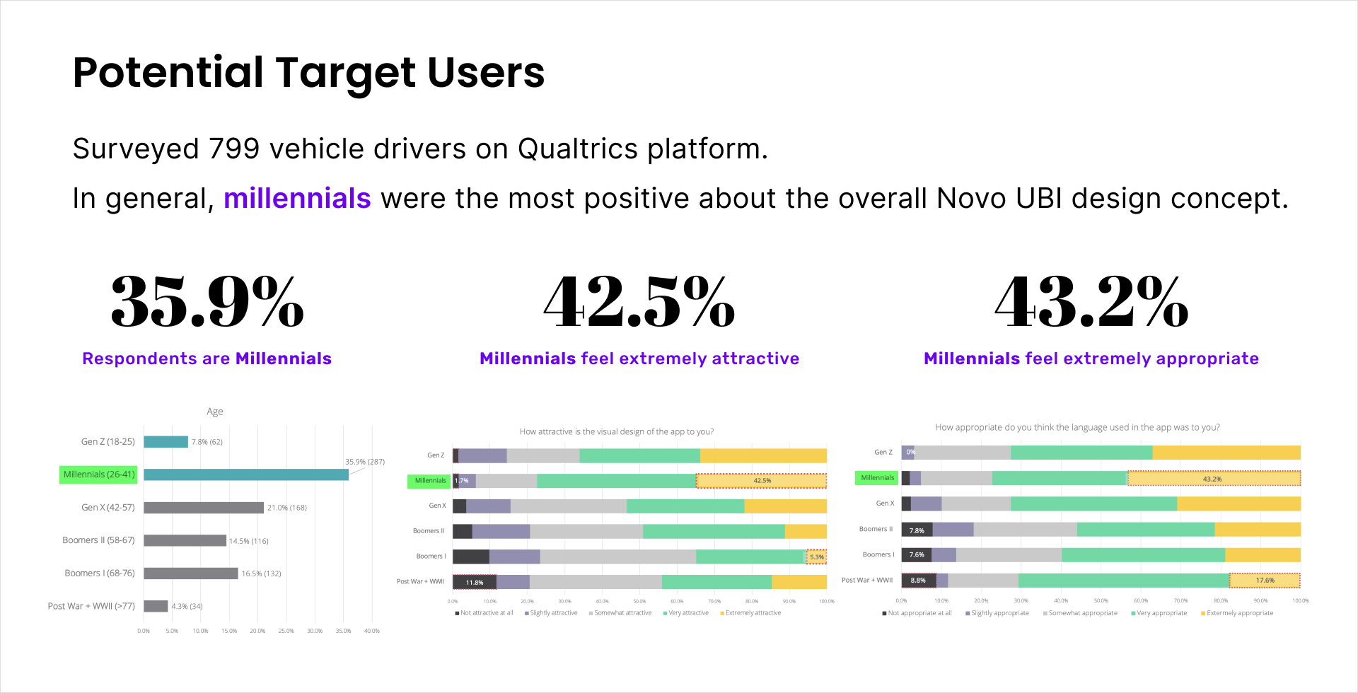
Target Users
- Safety-Conscious Drivers
- Parents / Caregivers
- New / Inexperienced Drivers
- Drivers with Prior Incidents or Insurance Sensitivity
How might we make driving data more specific and relatable,
so users can reflect and see its impact on insurance?
How might we present driving scores in a way that encourages reflection and improvement without overwhelming users with negative visual feedback?

Copyright @ Po Hu. All Rights Reserved
Novo - UBI Driver Board
Mobile
Year:
2022-2023
Role:
Design Lead, UI & UX
Product Type:
Usage Based Insurance(0-1)
Project Overview
Team: Product Designer, Principal Brand Designer, Engineers, QA, Marketing/CI
NOVO Insurance helps users understand how their driving behavior impacts their insurance costs. Over a 12-month product cycle, I led the design of the Driving Board, from defining the initial MVP to evolving it into a behavior-driven dashboard powered by Cambridge Mobile Telematics (CMT).
My role spanned all phases: from designing the 1st launchable version based on the acquired Motion Insurance app, to validating core concepts in a beta release, to reshaping the experience based on user feedback and platform constraints.
This case study focuses on Phase 3: major design evolution of the Driving Board, where I introduced weekly score breakdowns, trip-level insights, and behavior-based motivation to help users reflect and improve. Building on earlier phases, where I designed the initial launch version and validated core concepts, this iteration aimed to make driving data more actionable and personally meaningful.
Business Goal
Reduce claim/loss rates by encouraging safer driving behavior.
User Impact Goal
Help users understand their driving and improve their driving habits to potentially save money on car insurance.
How might we make driving data more specific and relatable,
so users can reflect and see its impact on insurance?
How might we present driving scores in a way that encourages reflection and improvement without overwhelming users with negative visual feedback?

Copyright @ Po Hu. All Rights Reserved