
Novo - Safety Map
Mobile
Year:
2022-2023
Role:
UI & UX
Product Type:
Insurance Linked Feature
Project Overview
Team: Product Designer, Principal Brand Designer, Engineers, QA, Marketing/CI
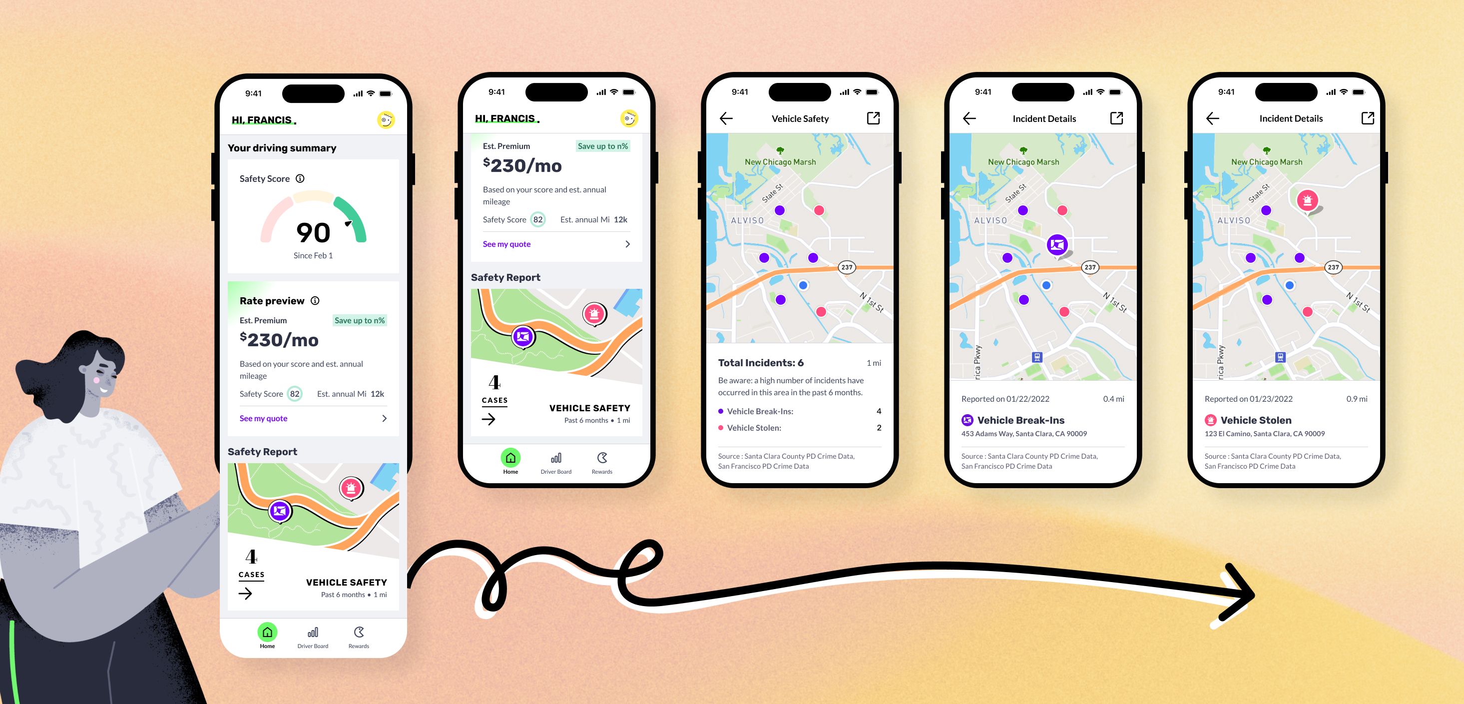
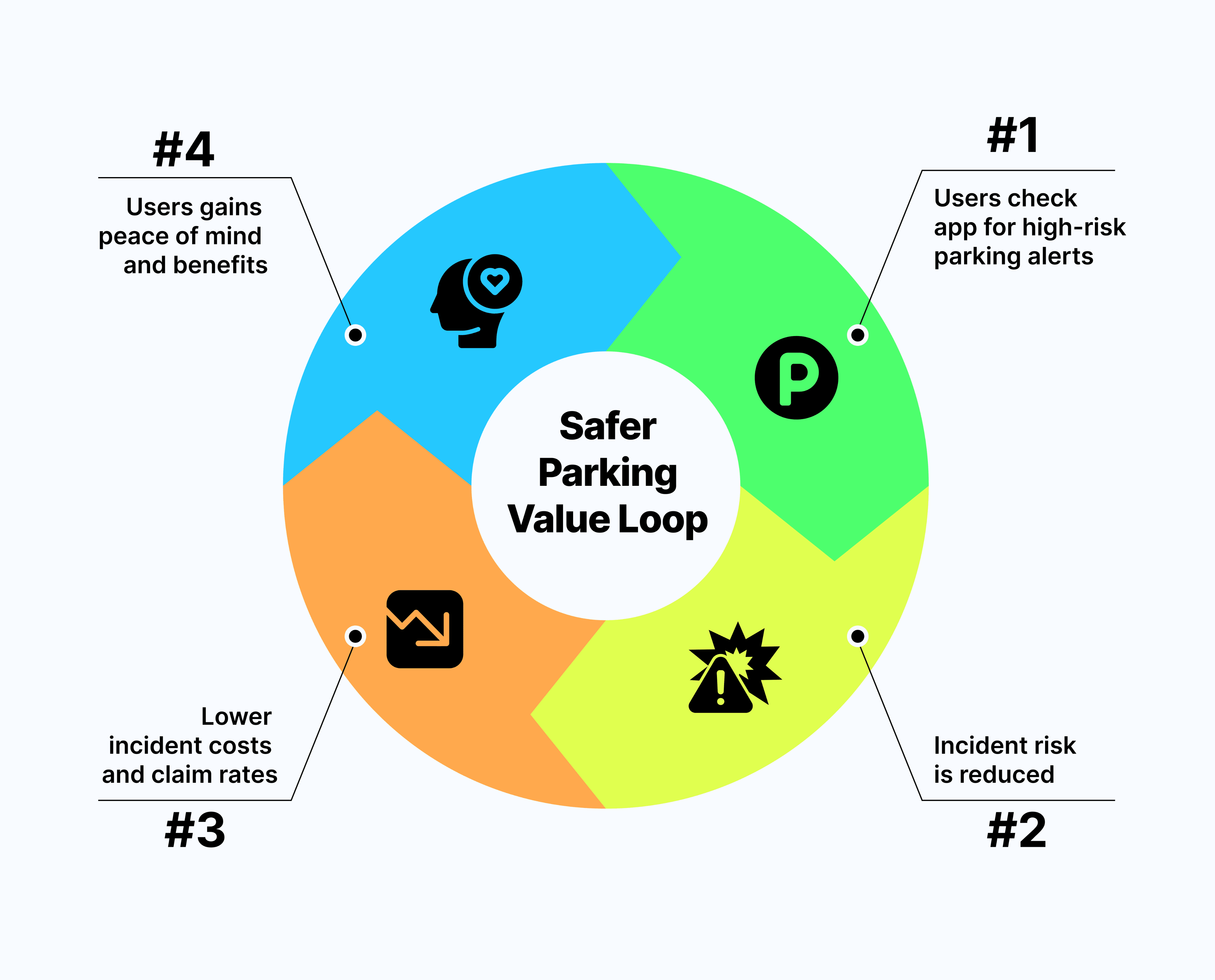
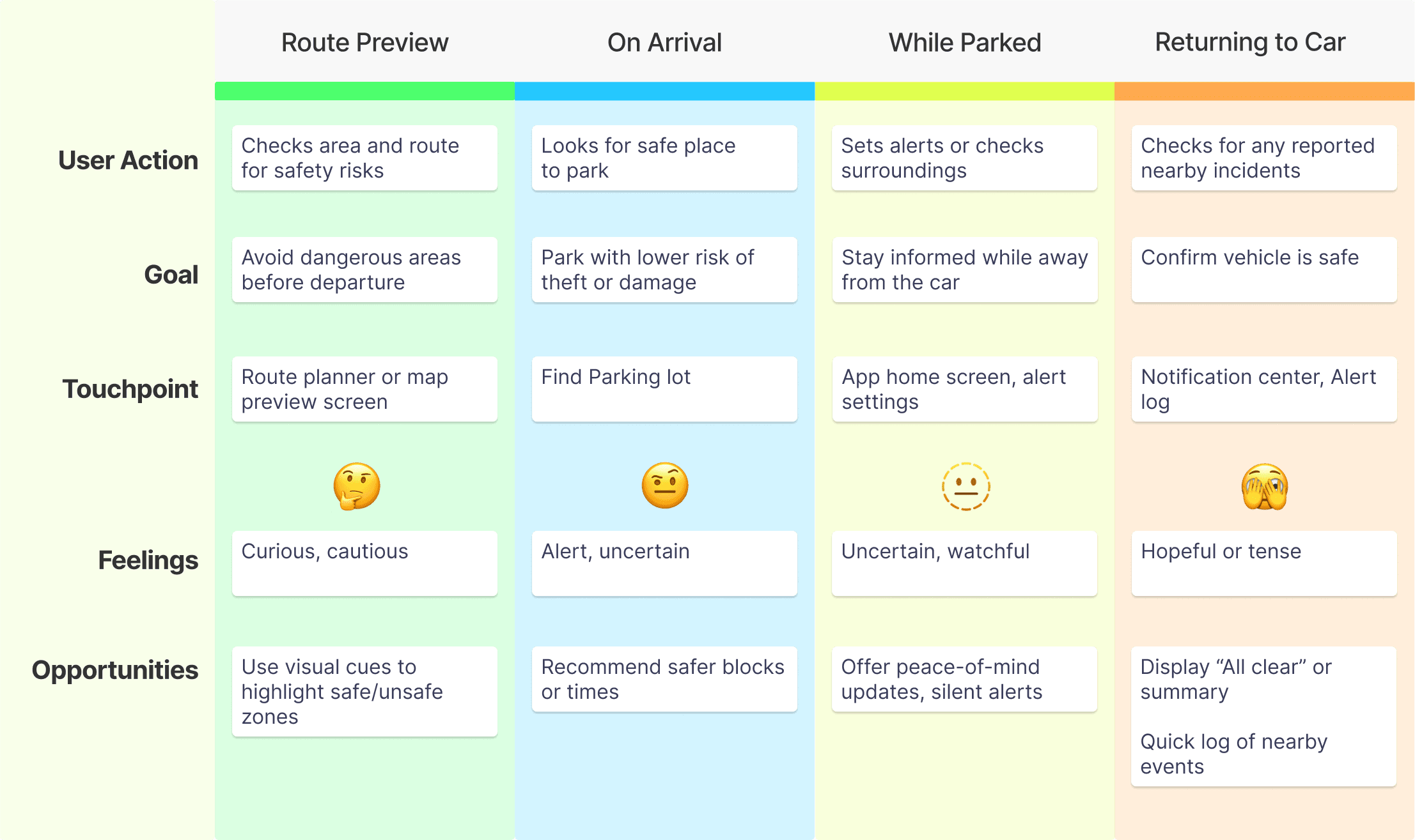
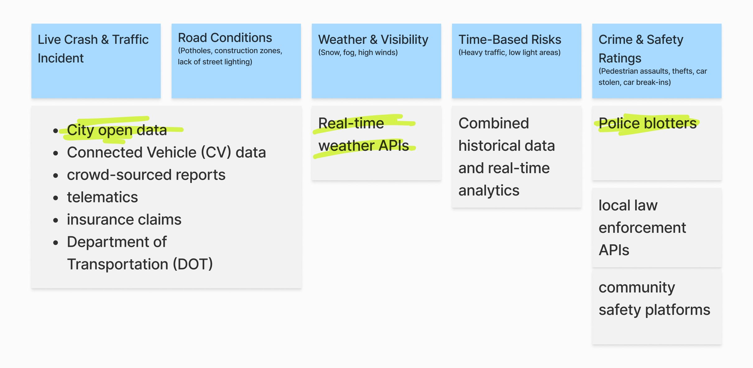
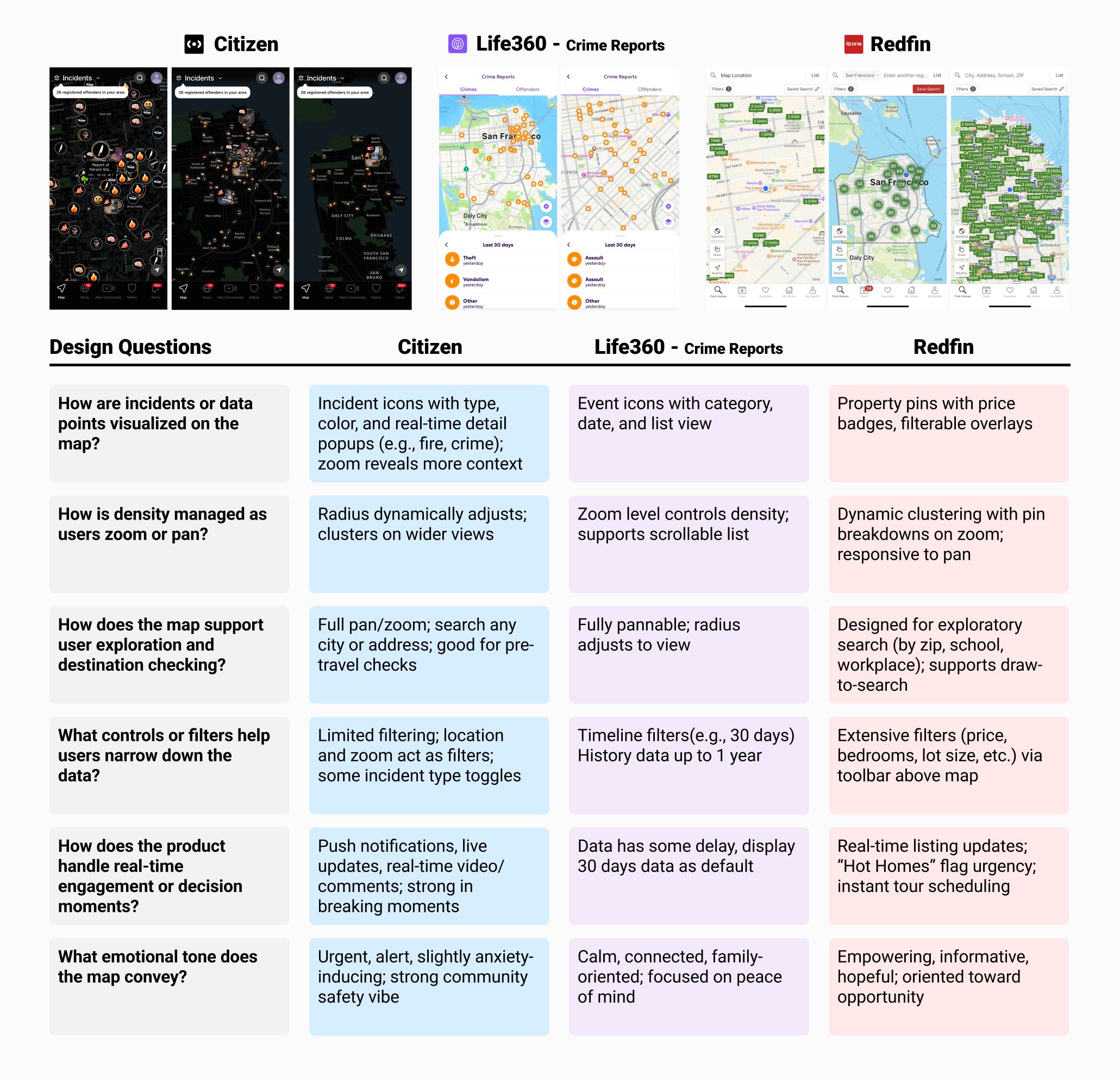
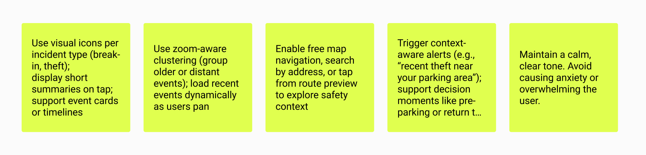
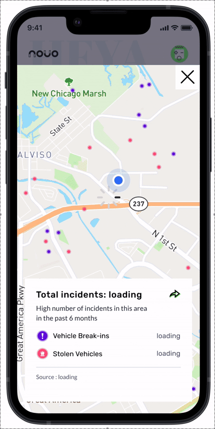
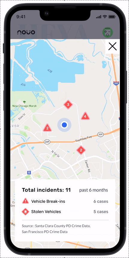
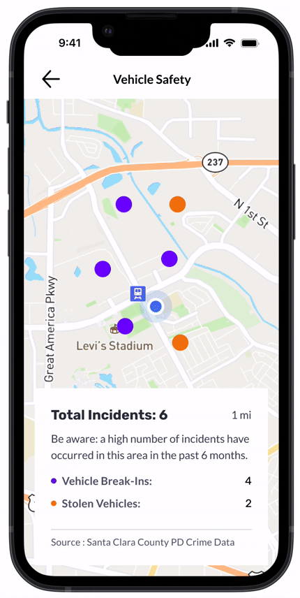
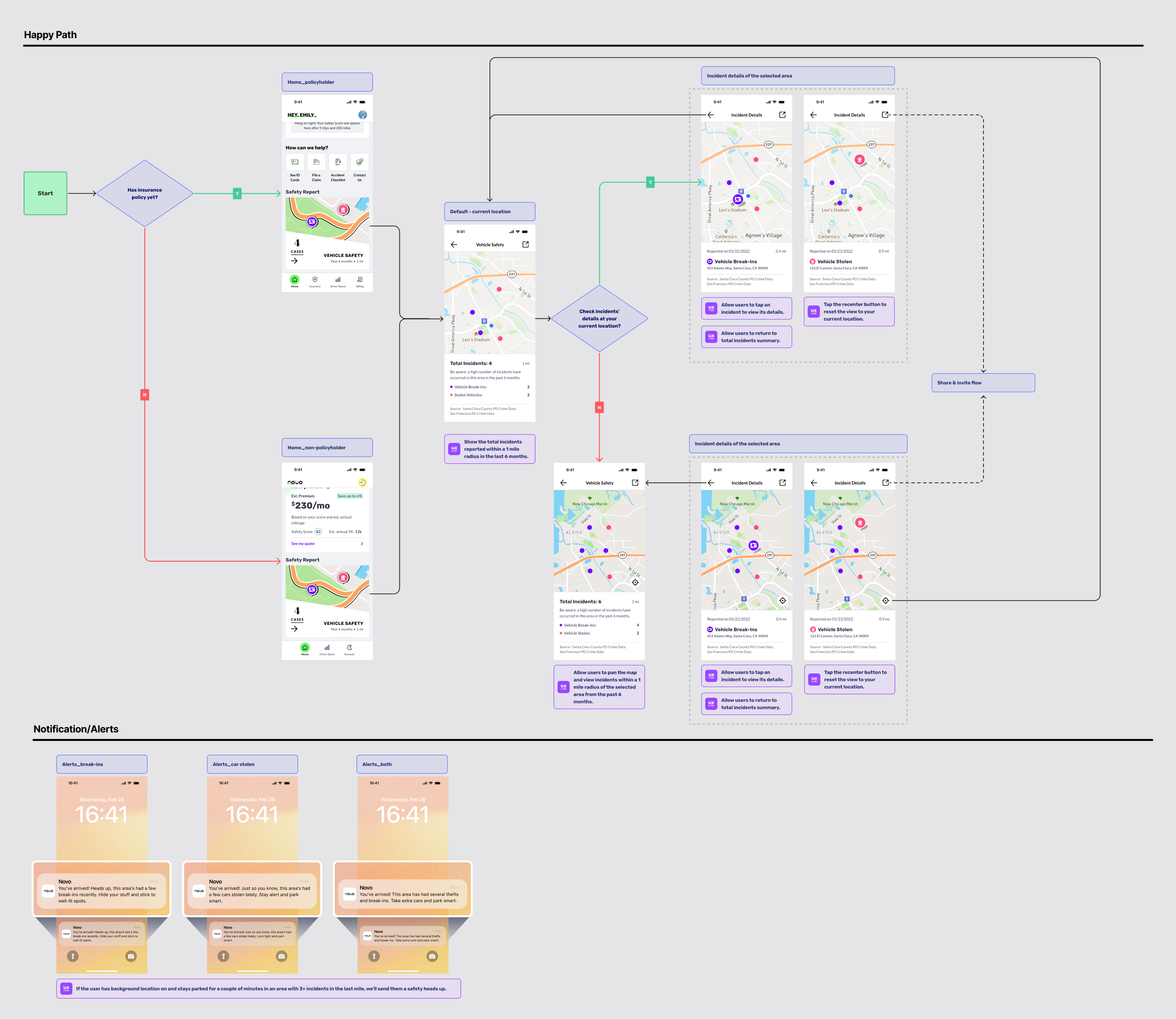
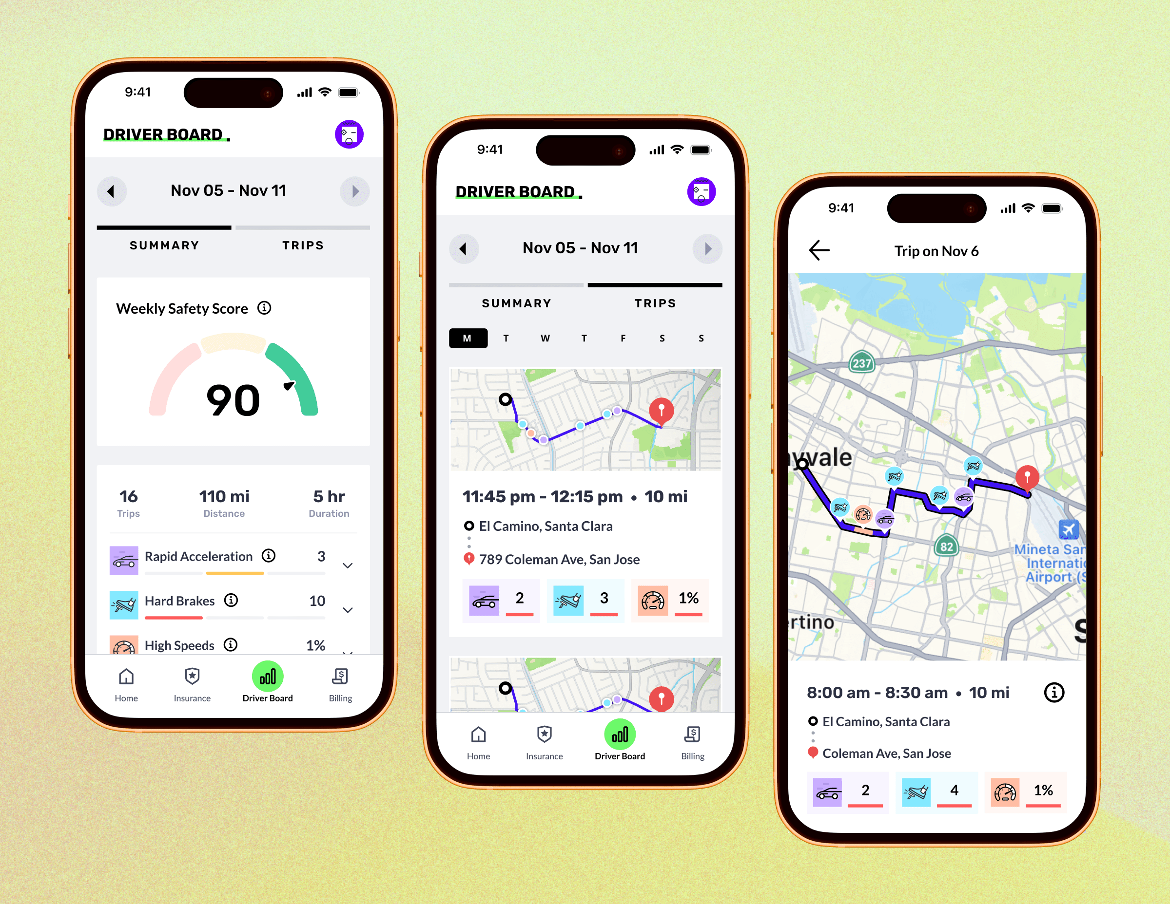
The Safety Map was introduced in the early product phase to display recent vehicle-related incidents, such as break-ins and car stolen, based on data from the past 3 months. Launched before the app had a large policyholder base, the feature was designed to offer immediate safety value to all users, encouraging daily engagement and building trust. It also supports the app’s long-term vision of enabling safer driving behaviors and future Usage Based Insurance adoption.
Product Goal
Support users in avoiding local risk zones and reducing potential vehicle-level incidents and benefiting both the user and the insurance provider.
User Impact Goal
Make informed parking decisions, reduce the likelihood of theft or damage, and build safer habits that contribute to better insurance rates over time.

Copyright @ Po Hu. All Rights Reserved
Novo - Safety Map
Mobile
Year:
2022-2023
Role:
UI & UX
Product Type:
Insurance Linked Feature
Project Overview
Team: Product Designer, Principal Brand Designer, Engineers, QA, Marketing/CI
The Safety Map was introduced in the early product phase to display recent vehicle-related incidents, such as break-ins and car stolen, based on data from the past 3 months. Launched before the app had a large policyholder base, the feature was designed to offer immediate safety value to all users, encouraging daily engagement and building trust. It also supports the app’s long-term vision of enabling safer driving behaviors and future Usage Based Insurance adoption.
Product Goal
Support users in avoiding local risk zones and reducing potential vehicle-level incidents and benefiting both the user and the insurance provider.
User Impact Goal
Make informed parking decisions, reduce the likelihood of theft or damage, and build safer habits that contribute to better insurance rates over time.

Copyright @ Po Hu. All Rights Reserved